The Value of Space Exploration, via Phil Plait.

Neil Gaiman on The Fairy Feller’s Master Stroke, a painting by a madman that’s inspired its share of stories.

And from Comics Worth Reading, our WTF entry for the day: Paradise by the GoPhone Light. It’s a commercial done in the style of a music video, featuring Meat Loaf and Tiffany as the parents of a kid who wants a GoPhone. Completely surreal, especially once the random explosions start.

It’s just occurred to me that, aside from it being some sort of cell phone, I have no idea what a GoPhone is. [/me types “gophone” into Google] Ah, OK. Pre-paid cellphone. Meh. (And now I’m imagining how much spam is going to get posted to this thread. *sigh* )

I’d known that artist Roy Lichtenstein‘s most famous works were done in the style of gigantic comic book panels. Something I didn’t know was that many of those paintings weren’t just in the style of comic panels, but were blown-up copies of specific panels from actual comic books (done, of course, by other artists).

An art teacher named David Barsalou has been tracking down the originals. He has a website, Deconstructing Lichtenstein, which displays dozens of actual comic panels side by side with the corresponding Lichtenstein paintings.

Some are nearly exact. Some depart a bit more, but many of those actually keep the same dialogue or narration. And yet, somehow Lichtenstein’s work has been hailed for decades as “original.”

(via A Distant Soil)

Over the weekend, Something Positive’s Monette met her girlfriend’s half-brother, who wants to write showtunes when he grows up. Friday’s Real Life featured Tony taking Greg to task over singing a song from Monty Python’s Spamalot. Where did the showtunes=gay (or at least effeminate) stereotype come from? While we’re at it, where did the art=gay stereotype come from?

I mean, most of the people who actually write musicals are probably straight. Not all of them, of course, and some of the exceptions (Cole Porter, for instance) are rather prominent. And I would guess that a majority of the actors and audience are probably straight, also.

I have no doubt that the percentage of gays in the arts is higher than in the general population. I studied drama in college—all I had to do was look around to see that. But that’s a far cry from “most.” I mean, to pull some numbers out of thin air, let’s say it’s 20%, or even 30%, instead of the commonly-cited 10%—that would be like saying an industry with 30% women is primarily female. Continue reading

There are two books I picked up recently that demonstrate how not to tell a story with pictures: Teen Titans #27 and the manga of The Nightmare Before Christmas.

First, Teen Titans #27, first half of a two parter by fill-in team of Gail Simone and Rob Liefeld. I’d planned on writing a more thorough review, but Comics Should Be Good beat me to it. And yeah, reviewing Liefeld’s art feels like a cheap shot, but sometimes ya just gotta go for it. Simone’s story isn’t bad, but it’s hard to follow. In particular, there are too many places where the art isn’t about story or action, it’s about showing the heroes or villains in dramatic poses. And yeah, you want the occasional dramatic pose, because you want to show off the costumes. That’s part of the genre. But you need to convey what’s actually happening. As dramatic as the last two pages were, I couldn’t figure out just what Kestrel was doing without looking at the “Next issue” blurb!

And then there are the places Liefeld left out dramatic poses that should have been there. The issue introduces a quartet of teen villains, but only one of them gets a full-body dramatic view, two get only action shots, and one—well, let me put it this way. I had to flip back to the beginning to be sure that there really were four of them and not just three. He’s in two panels with only his head and shoulders visible in the entire book. He’s not named, there’s no sign of powers or special skills, and he’s wearing a shirt and tie. I have to wonder whether Liefeld just didn’t get around to designing a costume since the character gets eliminated halfway through the book.

Anyway, onto The Nightmare Before Christmas. Continue reading

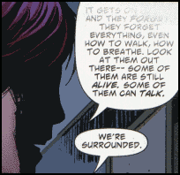
Mnemovore #5 came out this week. (For some reason issue #4 shipped twice—once just before Comic-Con and again last week.) This week’s issue, or at least my copy, has a strange quirk to it. Some of the word balloons are faded, as if a rubber stamp was pushed down with unequal force, or as if someone ran a gradient tool over the text with Photoshop. I’m still not sure whether it’s intentional or just a coloring or printing error.

This scan should be relatively non-spoilery:

Panel showing faded word balloon

At one point I thought they might be the result of coloring gradients applied above the word balloons instead of below, but I could only get a few to match up.

The thing is, it’s appropriate for the book—if maddening to try to read. The premise is that into our information-saturated world has come a predator that feeds on information, eating people’s memories and leaving them amnesiac or worse. In a story about information loss, gaps in information make thematic sense. And there was one panel with the same effect last issue: “They can make it so you can’t…”

Just one issue to go…