Fury after Facebook messes up smartphone users’ address books:

Remember how Facebook sneakily changed your default email address to @facebook.com? … Some smartphone users…are reporting that their on-phone address books have been silently updated to make @facebook.com email addresses the default way to send a message to their contacts.

The lesson: Whenever you change something, always consider the impact on things that depend on it.

This reminds me of the ill-fated Network Solutions attempt to replace failed DNS lookups with responses directing web browsers to search pages, not considering that web browsers aren’t the only software that uses DNS, or that some of that software might depend on accurate “this domain does not exist” info.

Originally posted on Google+
Some recent linkblogging. (Thank you, StumbleUpon)

Art

Privacy

Scott Pilgrim

I use the Broken Link Checker plugin on this blog and on Speed Force to find broken or moved links. In addition to helping you manage them in the admin interface, it can also assign formatting (as a CSS class) to mark them in your posts.

Cool! Readers can see that the link is broken before clicking on it!

But what’s the best way to label the links?

The plugin uses strike-through by default. You are marking something that’s gone, but strike-through usually means the text is being crossed out. That’s fine for a link in a list, but something like “Catering was provided by MyNiftyFoodCo” implies that the name of the company is wrong, not that the website is gone.

Just making something italic or changing the color doesn’t work either, because it’s arbitrary. Nothing about an italic link (which could be a title), or a random other color, suggests that something might be missing.

What I’ve come up with is to reduce the contrast on broken links. It combines two familiar schemes:

  • High contrast for new links and low contrast for visited links.
  • “Graying out” inactive items in software.

So here, I’ve got bright blue for new links, darker blue for visited links, and broken links as black (well, very dark gray), the same color as surrounding text. I’m keeping the underline in place so there’s still some indication that it’s a link, but it’s not as strong as the label for one that’s still functional.

It’s still not ideal, since color is the only difference, but it should cause less confusion than the strike-through.

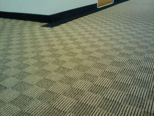
The new carpet seems designed to keep hallways clear by maximizing eyestrain. I fear a photo won’t do it justice. HP Lovecraft might.

Carpet made up of alternating light and dark squares with pin stripes.

The photo doesn’t do it justice. It’s yellower, and the sea of pinstripes makes it shimmer to the eyes. Looking along an entire hallway, the pinstripes get narrow enough that I could swear it produces moire patterns on the retina.