I’d never bothered with the outline property in CSS before, mainly because I could never see what made it different from border. OK, it doesn’t affect the object’s size or position, but you can account for that when designing a page. And I could see it might be useful if you wanted to have a two-layer border around an object, since the outline starts just outside the border.

Well, Firefox is nearing 1.1 alpha, and among the new features is real support for outline. I figured I’d set up a test page and see what happened.

I set up two classes, one which applied an outline and one which applied a border, and just tried them on different objects. <p> only looked different in positioning (since border is just inside the edge, and outline is just outside), but <span> illustrated the difference clearly:

Screenshot of outline and border.

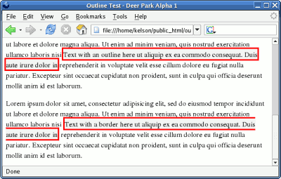
The first paragraph has some text with an outline. The second has text with a border. In both cases, the text wraps at the edge of the window, but while the border breaks and picks up again on the next line—as if the span had simply been chopped into pieces—the outline completely encloses each section on its own. This fits with its intended purpose, which is “to make [elements] stand out.”

Opera and Konqueror (and presumably Safari) seem to handle outline already, and display my test page the same way as Firefox 1.1.

Here’s a good one: The Daily Sucker has found 300+ organizations using a legal statement containing the phrase, “Wow You actually came to this page.”

Highly professional, that, along with “Our lawyers made us include it and made us use a precious link on our home page to get you here.” Which isn’t to say that I don’t appreciate the sentiment, but the fact that it’s been copied over and over is…interesting to say the least.

It does make me wonder who originated the statement, though.

Several months ago, I went on a minor site optimizing kick. One thing I decided to do was replace the validation labels with something smaller, less obtrusive, and directly on the page. I tried to duplicate the look of the classic antipixel-style buttons by splitting a link into two <span> elements, but had so much trouble getting borders and height to match up correctly that I wrote it off completely.

After a while I came back to it, and started with very simple buttons like this:

How the first CSS badges should look

Your browser shows this as:

Valid XHTML XFN Friendly

Here’s the CSS and HTML used for this version: Moved to Tech Tips.

I finally put together a new layout! I tried to do as much as possible in CSS and leave the HTML as little changed as possible, and when I finished I was able to keep the default WordPress layout as an alternate. In theory I ought to be able to plug in any of the submissions from the WordPress CSS Style Competition as alternates as well.

It’s been tested so far on Mozilla, IE 6, Opera 7, and Konqueror 3.2. It doesn’t use anything more complicated than Fahrner Image Replacement, so it shouldn’t cause too many problems. I’ll try to test it in a bunch of other browsers at work tomorrow.

I consider this a first draft – among other things I figure on adding to the main title banner – but it’s something a bit more distinctive than the out-of-the-box layout we ended up with after the upgrade to 1.0.

Updated Feb. 12 and Feb. 13 to describe testing in more browsers and the interesting saga of tracking down a bug in Internet Explorer 5.0: Continue reading