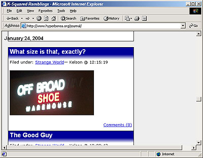
A few weeks ago I started experimenting with a new look for the site. I tried some ideas, showed what I had to Katie, and we hashed out what did and didn’t work. I’m trying to do as much as possible through CSS, to make previewing as easy as possible and to make theme switching easy as well.
I backported a few minor changes into the current look, and I also made one important change for usability: I finally switched from using Fahrner Image Replacement for the banner to using Leahy/Langridge Image Replacement (LIR). Why? Accessibility. People discovered that FIR didn’t actually succeed in what it was meant to do: allow screen readers to pick up the text for blind users while showing the formatted graphic logo to sighted users. LIR seemed like the least intrusive of the other techniques available.
Anyway, I’ve been messing around more with CSS, and Katie will be working on the graphics for the new banner. If you’re using Firefox or another browser that supports alternate stylesheets, you can see a preview by selecting the “Experiment” stylesheet. (On Firefox it shows up as a small palette in the lower left hand corner.) Actually, if you’re curious about how this would look with the default WordPress template, you can try the “WordPress” style. It’s… different, to say the least.


