We were at the grocery store earlier today, and Katie was grumbling about the stylus-only touch screens they had for entering a PIN. Unlike actual keypads, you can’t hide the number you’re entering, because you have to move that stylus around instead of 10-keying it in.
On one hand, a touch screen with a stylus is great for visual feedback and for collecting signatures, because the store can keep things on file digitally instead of or in addition to a paper copy. And once you’ve got that, it’s reasonable to drop the keypad, since you can simulate it in the touch screen. But unless it can react as quickly as actual buttons, and react to fingers instead of a stylus, it can’t completely replace the way a keypad is actually used.
An even better example is checkout line at Fry’s.
For those of you who don’t know, Fry’s is a chain of gigantic computer/electronics stores. They sell hardware, software, and components, TVs, CDs and DVDs, stereos, phones, kitchen appliances and kitchy appliances. It’s the only computer store I know of with a snack food aisle, and the stores are usually converted warehouses. I’m talking huge.
The checkout lane is set up as a long counter with several dozen checkout stations with a single line running parallel to the counter. An employee stands on a stool at the front of the line to direct customers to the next available cashier
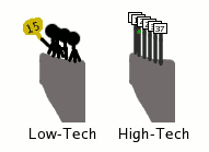
When they first opened a store nearby, each checker had a numbered sign on a handle they would raise whenever they finished with a customer, and the spotter would see it and direct the next person in line. If the checker held the sign up backwards, it indicated they needed a supervisor to assist.
Now, each station has a pole with a pair of red and green lights and the station’s number at the top. The green light indicates the cashier is ready, and the red light indicates they need a supervisor. Sounds good — you don’t need to worry about losing the signs, or getting them in the right order, the checkers don’t need to hold the signs above their head, etc.
But think about this. Remember, the spotter is looking at this from one end of the row:

Now, which of these makes it easier to see the number of the available station? You got it: the low-tech one. This doesn’t mean that using lights for this is a bad idea, but the way it’s done actually makes it worse than the old way of doing things.
(Edit) One simple way to make it easier to read would be to make each pole a slightly different height, raising them higher as you go down the line so that you can see past the closer signs.
It’s been years, though, with no sign of change. (It’s high-tech, so it must be better!) Their employees have just had to deal with it. Many of them probably weren’t there before the switch.

