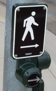
 I recently took a walk through some streets that have only recently opened to traffic. One of the things that struck me was that the buttons for triggering the walk/don’t walk signs had a new design. Instead of a tiny recessed button, or a larger rounded button, they had a ~2″ flat button with a raised arrow.
My first thought was, why the extra arrow? It’s pointing in the same direction as the sign. And it means you have to press the button carefully instead of just whacking it with your hand. The answer hit me later in the walk. I was leaning on the button with my hand when the light changed, I and felt the button vibrating. Of course! It was for blind pedestrians!
The raised arrow makes it easier to hit the right button, rather than just hope that the buttons have been placed in standard orientation. And vibrating the button makes it clear not only that it’s safe to cross, but in which direction it’s safe to cross. That’s one thing I could never figure out about the chirping walk signs in San Diego. It tells you the light’s changed, but if there’s any indication as to which light is green, I’ve never noticed it.


I love that they did that. As someone who’s eyes continue to get worse, I’m very thankful for those things. That will be extremely helpful to a good number of people.