I appreciate that Apple offers a single software updater for all its free Windows software. But one thing annoys me about it.
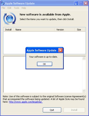
It opens a window, then opens a message box showing a progress meter as it checks for updates. Only one problem: It fills out the “New software is available” caption before it actually checks.

New software is available… oh, wait, no it isn’t.
This isn’t an issue on Mac OS X, because the progress meter is shown as a sheet, which drops down from the top of the main window and obscures the caption. But on Windows, that caption is visible from the moment the window appears, saying that you really do have something new available, raising your hopes that maybe, just maybe, Apple has finally gotten around to releasing that new version of Safari, or that security fix for the flaw you heard about a week ago, then dashing them to the ground.
Or, less dramatically, it’s jumping to conclusions, providing potentially false information.
And then, even if it turns out there isn’t anything new, the caption stays in place…leaving you with two contradictory statements as to whether any updates are really available.

Funny, I was going to post a complaint the other day about Android doing this with its system updater, except telling you it *is* up to date before checking (instead of just telling you it’s checking).
Bad UI designs are eternal. *sigh*