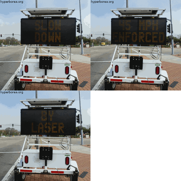
I drove by this sign while listening to “Ashes to Ashes.” With timing like that, I had to turn around and get a photo.
Category: Signs of the Times
Split Seating
It’s not quite as good as the Microsoft Surface billboards I saw a few years back, but it’s the first pair since then to prompt me to share a photo. The two signs are usually rented out together, but advertisers typically just pick two boards from a campaign. I appreciate the effort to design a pair of signs that only really make sense together.
Even if it does seem to suggest that you’ll be dismembered in order to fit better on the airplane.
Oddly Specific Advertising
I’ve been driving past this billboard on PCH all week. I can only assume it’s part of a series of “The perfect mattress for ____” ads. Either that or they’re going for some serious niche marketing.
Panorama Fail: Chalk Edition
AAAAAARP!
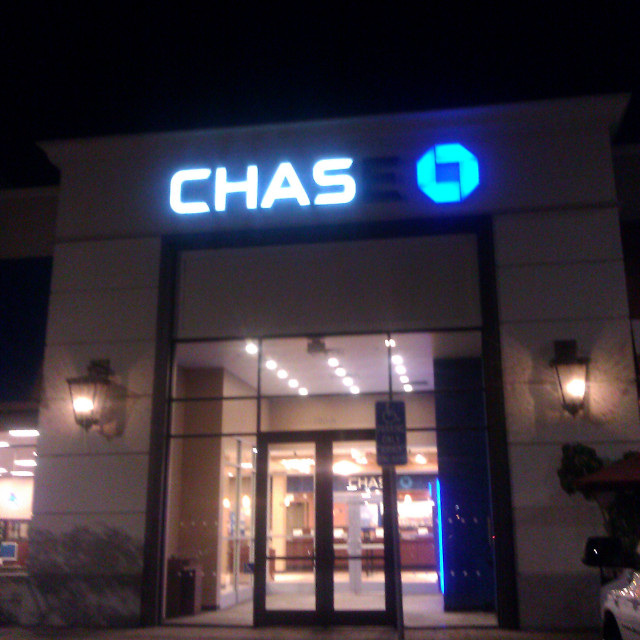
When I first spotted this sign, the ampersand in the middle looked like just one more A. It only resolved as I got closer.
Update: Sometime in January they replaced the ampersand with an E. No idea why. They didn’t use it somewhere else. Or maybe they did and changed it again, but didn’t bother to put it back where it made more sense.
Now it really looks like someone tried to write a burp — even in broad daylight!