Mobile Web Layouts vs. the Viewport
A few years ago, I tried to give some of my most-used websites a nice, clean look on mobile browsers by adding a stylesheeet with the “handheld” type. Then the iPhone came out and ignored them, and everyone copied that behavior, making it useless.
Somewhere along the line, I revisited the same CSS techniques, but used the “max-width” media query to change the layout on smaller screens. This seemed even better in the long run, since screen size matters more than whether a device is a desktop computer or a handheld computer. (The iPad was nothing but a long-standing rumor in those days, but demonstrates this clearly.)


That worked great on the iPhone, and on the G1, which I updated through Android 1.6. I stopped testing it after a while, and no one commented on it, so I figured it was still working. (Reminder to self: that’s always a mistake.)
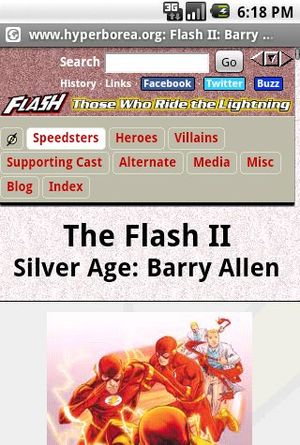
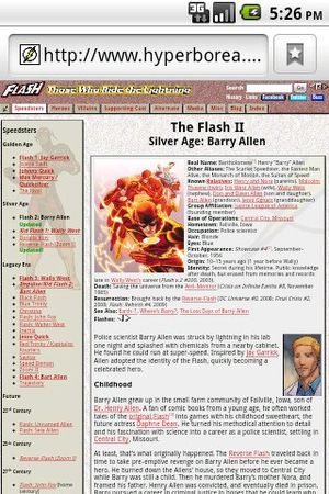
Last week I got a G2, which came with Android 2.2. Last night I visited one of my websites, and was presented with this shrunken, unreadable mess…because Android doesn’t actually use the real screen size anymore. It pretends it has a bigger screen so that it can present a desktop-like view and then let the user zoom around. Mobile Firefox does the same thing.


<rant>Why is it that every time I find a clean technique to use the same markup on both desktop and mobile devices, some browser manufacturer decides to bypass it in favor of giving the user a clunky imitation desktop view instead of one optimized for their experience?</rant>
ahem
Anyway, it turns out it’s possible to fix this problem with the as shown here:
<meta name="viewport" content="width=device-width">
So I can provide nice, clean small-screen layouts again…after I add extra markup to every single page that uses these stylesheets.
Problem solved!
Well, almost. It fixes the layout…but it also prevents the user from zooming out for quick scrolling, which can be awfully useful on a long page.