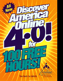
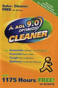
 I’d seen an AOL CD packaged to look like laundry detergent before (Tide, specifically), but this seems to take it a step further.
I think what makes it seem strange to me is the fact that they made “Cleaner” more prominent than “AOL.” Sure, you can’t miss it, especially with the running man icon, and of course they’re plugging their filters and bundled antivirus (to clean your computer), but it just seems like they’ve taken the metaphor a bit far in the design.
