 I recently tried to retrofit a mobile layout onto an old table-based site using CSS. It was a fairly simple layout: A banner across the top, two columns, and a footer. I figured I’d use CSS to “unwrap” the table and make the sidebar and main content area into full-width sections instead of side-by-side columns.
 In theory this should be simple: CSS handles tables by using the
 display property and assigning it table, table-row and table-cell for the <table>, <tr> and <td> elements. You can assign these properties to other elements and make them act as tables, or you can assign block or inline to these elements and make the table act like a series of paragraphs.
") Initial testing worked perfectly in Firefox 3.6 and Opera 10.5x. Internet Explorer 8, as expected, ignored the changes entirely. Chrome, however, did something very strange, and Safari reacted the same way: The banner shrank, and the columns changed from a narrow sidebar to a 50/50 split…making it actually worse for small screens.
Initial testing worked perfectly in Firefox 3.6 and Opera 10.5x. Internet Explorer 8, as expected, ignored the changes entirely. Chrome, however, did something very strange, and Safari reacted the same way: The banner shrank, and the columns changed from a narrow sidebar to a 50/50 split…making it actually worse for small screens.
Clearly WebKit didn’t like something I was doing. Unfortunately, WebKit powers the exact platforms I was targeting: the iPhone and Android!
I dug around with the developer tools a bit to see if I could figure out what was going on. Was the browser not applying the property? Were the table cells inheriting the “original” property from somewhere else? Did I need to change properties on thead and tbody as well?
 What I found was that WebKit did recognize the
 display:block I had added, but somehow the computed style was reverting to display:table-cell. This only applied to table and td, though. Table rows actually did what I told them to, which was why the result ended up looking bizarre.
If it hadn’t changed anything, I probably would have chalked it up to the capability just not being implemented yet. But since it worked on table rows, but not on cells, I decided to treat it as a bug in WebKit and went looking for the best way to report it. I ended up creating a WebKit Bugzilla account and reporting it as bug 38527.
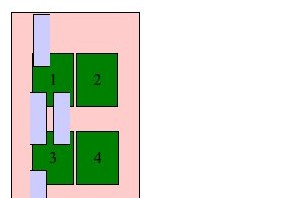
Check out the testcase in Firefox 3.6 or Opera 10.5 to see what it should look like, then take a look in Chrome 4 or 5 or Safari 4.


Did you ever find a solution to this?
No luck, but then I haven’t really gone looking for a workaround. I am kind of annoyed that my bug report is still listed as unconfirmed, though. I feel like I filed it to /dev/null.
got the same problem, at least i’m not the only one to have noticed it!!
really annoying bug
Well here’s an interesting thing.
I was having the exact same trouble, but I found that when I added ANY valid doctype, it did respect my display values for table elements.
I guess having no doctype triggers quirks mode, that behaves in a more reliable table-y fashion, for old table-y code.
Thanks for the tip here @Toby. I was dealing with the same problem, and changing to the HTML5 doctype fixed the issue!
It’s been almost five years now, and the bug remains present in both Chrome and Safari…and unconfirmed in the bug database.
Setting a DOCTYPE does fix the issue when you try to override td/tr with display:block.
Setting a DOCTYPE does not fix the issue when you try to override td/tr with display:inline. It does improve matters a little bit by just ignoring the style, so it looks like it does in old versions of IE, but it doesn’t actually unwrap the cells into inline elements the way Gecko does.