Since I started converting parts of my website to use 11ty as a static site generator, I’ve been able to automatically generate tag and category pages that are *just there* as plain html files. And since they’re plain HTML, the old local site search engine I have on there still finds all the Eleventy-generated pages. And again since it’s all static, it doesn’t go down when the database does (which has been happening on an annoyingly frequent basis lately).

And this would be perfect if I was using a single Eleventy instance to build the entire site, but I’m not. I’ve got separate instances building the Les Misérables blog, the reviews, the tech tips, the creative writing collection, and so on, plus I have this WordPress blog and a bunch of hand-coded HTML from the old days.

Which leads to a few problems:

  1. Tags are per-section, not universal.
  2. The site search, which indexes html files on the server, sees everything except the WordPress posts, and the WordPress search *only* sees the WordPress posts.

Some ideas I’ve had to combine the tag pages:

  • Rebuild everything in a single Eleventy instance with a deeper hierarchy. Upside: Still static pages for everything except WordPress. Downside: Time-consuming, still leaves the main blog separate.
  • Write a post-build script that combines all the the tag pages from each subsite. Upside: Same. Downside: Need to either run on the server or make sure my local copies of the *other* subsites are current.
  • Write a server-side page that combines the backend HTML pages into a dynamic frontend for only the tag being viewed. Upside: simple. Downside: tag pages now depend on PHP.
  • Write some client-side JavaScript for the tag pages that will check whether other subsites have tag pages, and add those to the end of the list in a “See also…” section. Upside: simple, and the “local” tag pages are still usable as long as I make sure the script doesn’t block anything. I could even have it check the other static subsites first and then check the blog, so if the blog times out I still display everything else. Downside: requires JavaScript and additional network requests. But as long as I stick to vanilla JS, I can make it pretty small.

And for unifying the search:

  • Write a post-site-indexing script that adds the WordPress posts to the index. Could be done with direct DB access.
  • Write a pre-site-indexing script that generates a bunch of files for it to index. Seems like overkill.
  • Update the search code to send the same search terms to WordPress and combine the results.
  • Use a new search engine that indexes the served pages instead of the files on the server.
  • Point the search box at a remote search engine like Googl…yeah, never mind.

I haven’t settled on anything. I’m just kind of writing down ideas in public. If you have any suggestions, please let me know!

I use extensive filters on Gmail to categorize mail the way I want. I pre-filter some things to look at later, prioritize some lists (like allergy or uptime alerts), and pre-categorize things that I may want to file away after looking at them.

The problem is, I can only change filters on the desktop site. When I’m reading on my phone, I need to remind myself not to archive or delete messages that I want to start filtering.

It occurred to me: I can label those messages “Change Filter.” I could even do it right away – there’s a “Manage labels” option on the Android app!

Nope!

I can’t add labels in the app, just change the download and notification settings for each.

So, website then…

Except I can’t get at the full Gmail website on my phone. Or my tablet. Google insists on showing a stripped-down mobile site, which has even fewer capabilities than the app.

I can’t fault them for starting with the mobile site. It is helpful to focus on the features that work best on small touchscreens, under-powered processors, and high-latency, low-bandwidth networks, and can be done by someone on the go, rather than someone sitting at a keyboard with a big screen and a mouse.

But if someone wants to use the functionality you’ve left out, and is willing to slog through the desktop site on their phone or tablet, you should at least let them get at it!

In this case I waited until I could log in on a desktop, then added the label. But not everyone with a phone has a desktop or a laptop. And as the balance keeps shifting towards phones as people’s primary internet access device, that’s going to be more and more common.

A few interesting links that I’ve been meaning to post for a while now.

Geography and History

Using and Building the Internet

  • Warren Ellis has given up on Facebook and Google+ because it’s just so hard to reliably reach or listen to people. Think of how many posts in your news feed you miss each day just by not being online at the right time, never mind the pre-filtering Facebook does to the firehose.
  • Page Weight Matters – an engineer at Google led an effort to cut Youtube’s bandwidth requirements by a factor of ten. Strangely enough, when they started a live test, average page load time went up. It turned out that people on low-speed connections had found out about it and started using it even though it took two minutes to load where they were…because even that was still better than the 20 minutes they’d been stuck with before. (Via Raymond Camden)
  • If you run an email newsletter, keep in mind that many of your readers will try to read it on a phone. Keep that in mind when designing your format. Giant images with no text aren’t going to be too helpful.
  • How to keep electronics going when you lose power for days: Generators, batteries, car chargers, solar or kinetic chargers, etc.

Comics

  • Some of the earliest UNIX daemon art was drawn by none other than Phil Foglio of Girl Genius fame.
  • Saturday Morning in Front of La Salle De Justice is a painting by Rey Taira in DC Comics’ gallery show, inspired by Seurat’s famous painting Sunday Afternoon on the Island of La Grande Jatte (the painting at the center of Sondheim’s Sunday in the Park with George), but recast with the Justice League and other DC Comics heroes. It’s making the rounds again now, but I first saw it on Firestorm Fan a few months back.

A lot of web developers have forgotten the lessons of IE6, and just as they used to build desktop websites coded only for one engine, now they’re coding mobile sites specifically for Webkit, even when other browsers would be perfectly capable of rendering the designs they want.

This is exactly the sort of thing that gave IE6 such a stranglehold on the web for so many years (and as much as we’d like it to be, it’s not dead yet), with Netscape/Mozilla and Opera completely marginalized until Firefox managed to break through. It’s not quite so bad because two companies are driving WebKit (Apple & Google) rather than just one (Microsoft), but let’s try to learn from history this time around instead of repeating it.

Call for action on Vendor Prefixes – The Web Standards Project

The Web Standards Project is a grassroots coalition fighting for standards which ensure simple, affordable access to web technologies for all.

Originally posted on Google+

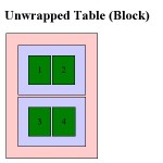
I recently tried to retrofit a mobile layout onto an old table-based site using CSS. It was a fairly simple layout: A banner across the top, two columns, and a footer. I figured I’d use CSS to “unwrap” the table and make the sidebar and main content area into full-width sections instead of side-by-side columns.

In theory this should be simple: CSS handles tables by using the display property and assigning it table, table-row and table-cell for the <table>, <tr> and <td> elements. You can assign these properties to other elements and make them act as tables, or you can assign block or inline to these elements and make the table act like a series of paragraphs.

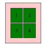
Initial testing worked perfectly in Firefox 3.6 and Opera 10.5x. Internet Explorer 8, as expected, ignored the changes entirely. Chrome, however, did something very strange, and Safari reacted the same way: The banner shrank, and the columns changed from a narrow sidebar to a 50/50 split…making it actually worse for small screens.

Clearly WebKit didn’t like something I was doing. Unfortunately, WebKit powers the exact platforms I was targeting: the iPhone and Android!

I dug around with the developer tools a bit to see if I could figure out what was going on. Was the browser not applying the property? Were the table cells inheriting the “original” property from somewhere else? Did I need to change properties on thead and tbody as well?

What I found was that WebKit did recognize the display:block I had added, but somehow the computed style was reverting to display:table-cell. This only applied to table and td, though. Table rows actually did what I told them to, which was why the result ended up looking bizarre.

If it hadn’t changed anything, I probably would have chalked it up to the capability just not being implemented yet. But since it worked on table rows, but not on cells, I decided to treat it as a bug in WebKit and went looking for the best way to report it. I ended up creating a WebKit Bugzilla account and reporting it as bug 38527.

Check out the testcase in Firefox 3.6 or Opera 10.5 to see what it should look like, then take a look in Chrome 4 or 5 or Safari 4.