I’ve only seen these signs in Irvine. I suspect that says something about them:

Senior Crossing Sign

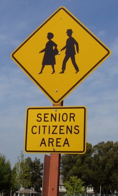
Perhaps an important warning to drivers, but it’s not a well-designed road sign. There’s too much detail, for starters—detail you’re not going to see clearly zooming by at 35 M.P.H. Compare to the stick figures of the standard school crossing sign, or even to the bunny crossing sign.

More importantly, the cues chosen to identify senior citizens are temporary, in the sense that they’ll look dated not too long from now. Why a hat, for instance? Continue reading

Found this in our mail server logs:

relay=OWNED.HACKED.BITE.ME [IP removed], reject=550 5.7.1 No mail accepted from known spam hosts or exploited systems

This was a connection we rejected because the sending IP was on the Spamhaus XBL list of exploited systems. (Everything from reject on is the error message we returned.) Apparently whoever wrote the spam tool decided to advertise that fact when sending mail.

AOL TideAOL 9.0 Optimized CleanerI’d seen an AOL CD packaged to look like laundry detergent before (Tide, specifically), but this seems to take it a step further.

I think what makes it seem strange to me is the fact that they made “Cleaner” more prominent than “AOL.” Sure, you can’t miss it, especially with the running man icon, and of course they’re plugging their filters and bundled antivirus (to clean your computer), but it just seems like they’ve taken the metaphor a bit far in the design.