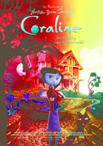
Neil Gaiman remarked on his blog that images his agent emails from Germany end up with the colors inverted, and posts an example of a Coraline poster:

Coraline (German, inverted colors)

“…ah yes, I thought. That’s the sequel, all right. CORALINE APOCALYPSE”

I used to run into this with TIFF images when building websites. (No big surprise, given that there are a million variations on the TIFF format.) I think it was around 2000 or so that I was working on a website for a law firm, and they sent me their logo. The logo, as I received it, was yellow on light blue, so I built a site with black text on a white background for the main areas, and yellow on light blue (matching their logo) for the title, navigation, and borders.

I sent them a link to the test site. They looked at it, and said it was very nice, but could I try to match the color scheme on their logo instead?

It turned out that red and blue had gotten switched around (and possibly more, because I can’t remember how the yellow ended up in there), but anyway it was supposed to be white on light brown. I switched the channels, redid all the graphics and styles for the site, and they stuck with it for several years.

Back on the subject of Coraline, Gaiman adds in his post that the film has become “the second highest grossing stop-motion film ever” after Chicken Run. So why does it seem to be forgotten already? Just two months ago, commentators were falling all over themselves to say Coraline was the turning point for 3-D animation being part of the storytelling and not just a gimmick. Now everyone’s talking about how Monsters vs. Aliens is the turning point for 3-D animation being part of the storytelling and not just a gimmick.
VXWorld: Crossing the Uncanny Valley – on the current state of the art of photorealistic computer animation, from Final Fantasy through Polar Express to Pirates of the Caribbean and Beowulf. As pointed out, one reason that Davy Jones worked so well is that he doesn’t look human. (via Neil Gaiman)

Firefox Floppy Disks – remember when software came on 3½-inch floppy disks? Or 5¼″? Just for fun, someone split the Firefox installer across 5 disks, complete with appropriate labels… and even took it a step farther

According to Microsoft Watch, Internet Explorer 7 will handle PNG Transparency. Not sure what their source is—it isn’t IEBlog—but if true, it’ll be very nice. Now we only have to wait another 5 years for everyone to upgrade or switch, and web designers will be able to make use of a very simple, but very useful effect in our normal layouts instead of only in the enhanced versions.

(via CNET Extra)

I saw an interesting article on Slate the other day: The Undead Zone: Why realistic graphics make humans look creepy.

The basic thrust of the article is that when something looks slightly human – say a cartoon, or a C3PO-like robot – we fill in the gaps. But when something looks almost, but not quite human, we start to focus on the things that look wrong instead. This was observed by roboticist Masahiro Mori, who called it the uncanny valley. The term refers to the appearance of a graph plotting emotional response (y) against how closely something resembles normal humans (x). Up to a point – say 90% – the more humanlike something is, the better people respond to it, until it reaches that almost-but-not-quite-there point where instead of responding positively, people start responding with revulsion and active dislike. Eventually, as things get closer to “real,” the curve swings back up again until the reaction is the same as to a normal person.

So what does this mean for video games? At least for some people — including the article’s author — state-of-the-art graphics are in that valley. We can get a very good representation of a lifeless but moving human being. Getting those last few details, pushing up the far side of the valley, is going to be very hard.