Twitter Blue is what happens when you start treating a tool as a status symbol, so you throw the tools away and start selling gold-plated hammers made out of thin plastic.

As anticipated, they’re getting rid of “legacy” verification in favor of charging people $8/month for the privilege of having a blue checkmark next to their name.

Not that verification was perfect before, but most of the complaints I heard prior to the enmuskification were “wait, that person got verified but this person didn’t?”…essentially treating it as a status symbol, indicating who’s worthy of being verified, rather than one tool in the toolbox to indicate that the account really does belong to who it says it does.

Making the blue check mark mean “This person can afford $20/month” instead of “This person is who they say they are” is only the latest way Twitter has downgraded its signal/noise ratio over the years.

Word is that Twitter’s new owner is planning to charge $20/month for a blue check mark.

Which of course, means the blue checkmark will now be useless. Well, useless to the users of the site, anyway. It won’t tell you which of several accounts is really the person you’re looking for, just who has $20/month to spend on it. (Not that it was perfect, but at least it was a signal.)

It’s sort of like when SSL certificates went from being expensive and needing verification — so they were a sign that you were on the right website — to cheap and later free. Except an SSL/TLS cert still tells you something: your connection is protected from eavesdropping. The checkmark doesn’t tell you anything valuable.

But Twitter’s been messing with the signal/noise ratio for ages.

Downgrade the Signal

Ads themselves (or promoted tweets, or whatever you call them) are already adding noise. Then they started showing you other people’s “likes,” removing some meaning from the action and adding noise to the stream. These days they even show you tweets from people that people you follow are following.

On Mastodon I’ll sometimes get distracted from something I wanted to do or look for, but I can almost always get back to it. I’ll pop onto Twitter for 5 minutes to look for something and I’m there twice as long because I can’t find it in all the attention-grabbing “features.” The other day I decided to unfollow all the corporations and organizations and only keep the actual people on the list, and I still had trouble finding things.

I suppose from Twitter’s perspective it worked, because I was there for 10 minutes instead of 5…but it makes me less interested in coming back later.

Every bit of noise you add to a signal cuts down on how much value the listener gets out of it. Eventually the ratio is no longer worth it, and all that attention you managed to extract from them by ratcheting up the noise drops to zero.

Despite an overall 7.0 rating, there are a slew of one– and two-star reviews of Into the Woods on IMDB. Did these people see the same movie I did? As I looked through several pages seemingly sorted by rating, a few common threads emerged:

1. Too much singing! It’s a musical. Unfortunately, the trailers seemed to be trying to hide this fact.

2. It wasn’t a fluffy, happy family movie. Well, no. It’s supposed to be a darker, more complex take on the stories. Again, the ad campaign wasn’t entirely clear on this, and several people said they had expected it to be kid-friendly because of the Disney name. That says something about the power of the Disney brand (especially when associated with fairy tales), and makes me wonder if it would have been better to release it through, say, Touchstone.

Interestingly, the things people were most upset by are things that were toned down (or moved off-screen) from the stage version. I guess the studio shouldn’t have bothered with those notes. And one recurring complaint, Cinderella’s stepsisters’ more extreme efforts to get into the shoe, is actually in the Brothers Grimm version (where her name is translated as Ashputtel).

Those two threads are a failure of the ad campaign to prepare people for what they were going to see. (Though the viewers complaining that it’s “not PG” seem a little unclear on the concept of “Parental Guidance suggested: Some material may not be suitable for children.”) But then there’s this…

3. It should have stopped before the final act. That would be missing the point, which is to follow through with the consequences of what everyone did in act one, and the personality traits that brought them through it.

Consider: How does Cinderella fit in with the royal family? How does Red Riding Hood deal with the trauma of her experience with the wolf? How is Rapunzel affected by her life in isolation? The baker and his wife had a lot of trouble working together just to get their child; how are they going to handle raising him? The princes are still going to be charming, and they’re accustomed to the chase. And when you come down to it, Jack broke into someone’s house, stole a bunch of stuff, and then killed him.

Admittedly, the second act isn’t as strong in the movie as it is in the play, because they cut out a lot of it…but I’ve heard the same complaint leveled at the show. That would be like cutting the second act of The Fantasticks. You could perform just the first act, sure, but it would be much less meaningful.

Once you get to the three-star reviews, you find more people who still didn’t like it, but understood what it was supposed to be. They didn’t like the performances, or thought the story structure didn’t hang together, or just don’t like Sondheim, or knew it was going to be a darker take but still didn’t like it. Fair enough. Everyone has different tastes, and what works for one viewer doesn’t always work for someone else. But at least they disliked it for what it was, not for what it wasn’t.

Though it would help if the ads had been a bit more clear.
Forget Ashton Kutcher and Oprah, forget #unfollowfriday, forget 25 Random Evil Things about Twitter — the key problems with the social media / microblogging / broadcast IM / whatever you want to call it service boil down to two problems:

  1. It asks the wrong question
  2. It was designed around limitations of cell phone text messaging

The Wrong Question

Twitter’s prompt is not something general like “What’s on your mind?” It’s “What are you doing?” That encourages people to post things like “I’m eating lunch” or “Just got into work,” or “Posting on Twitter.” Presumably what they mean is “What are you doing that you think people would find interesting?” but of course that’s too long a prompt from a usability standpoint.

The thing is, there’s no reason to broadcast the mundane to the world. Don’t tell me “I’m eating soup.” Tell me, “Just learned that gazpacho soup is best served cold. I wonder if they eat it in space?”

Unfortunately, that means the signal-to-noise ratio can get pretty bad at times.

Outgrowing its Limitations

Twitter posts are limited to 140 characters of plain text so that the your name and comments can fit in a standard SMS message. Now, this is great if you use Twitter via text messages on your mobile phone. It’s not so great if you use Twitter on the web, or through a smartphone app like Twitterific on iPhone or Twidroid on Android, or through any of the zillions of desktop apps.

I don’t have a problem with the 140-character limit itself (it can actually be liberating in a way), though it would be nice to have some formatting options beyond all-caps and *asterisk bolding*.

The real problem is that links have to share that limit. URL-shortening services have exploded lately as people try to squeeze links into the tiniest space possible to save room for their precious text. Even if you use something as short as is.gd, just including one link means you’re down to 122 characters.

Plus URL shorteners come with a host of problems, in particular the fact that they hide the destination. That’s no big deal if the target matches the description, or if it’s a harmless prank like a Rick Roll, but it’s all too easy to disguise something malicious.

Seriously, if you got an email that said something like this:

Look at this! http://example.com/asdjh

Would you click on that link? Even if it appeared to be from someone you know? That’s just asking to get your computer infected by a virus, trojan horse or other piece of malware. Or to see something you wish you could unsee.

Better Link Sharing: Facebook

I hesitate to bring up Facebook as a good example of anything, and I know the current layout is largely reviled by its users, but they really got posting links right.

When you want to post a link to your Facebook profile, you paste in the full URL. Facebook reads the page and extracts the title, a short summary, and possible thumbnail images. Then you have the normal amount of space to write your comment. Continue reading

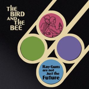
On my way to a doctor’s appointment before lunch, I heard a song on the radio that I liked and wanted to find out more about. I never assume that the DJ will actually identify the song, but I remembered I had Shazam on my G1, and for once it actually managed to identify the song! (Usually I’m trying to ID background music in a restaurant or shopping mall or someplace where half the time I can’t even recognize the song if I do know it). Thankfully for my dignity, it wasn’t Paris Hilton, but rather “What’s In The Middle” by The Bird and the Bee, from their new album Ray Guns Are Not Just The Future. (As it turns out, since it was Morning Becomes Eclectic, the DJ did name the song afterward. But still.)

Now, Shazam is very smart in that it offers a link directly to the song on the Amazon MP3 Store. So I could easily have just bought the song for 99ยข when I parked the car, except…

With unfamiliar artists, I like to at least check out the rest of the album and see whether I want just the one song, or more. And whether it’s a failing in Shazam’s app or the Amazon MP3 app, I could not find a way to go from the song to the album. So I shelved it until later.

Afterward, I opened the Amazon MP3 app by itself, searched for the group, and opened up the album. Another smart thing: If you preview a song on an album, it will go down the whole list playing a clip from each song. I turned up the volume, started the car, and listened to a summary of the whole album on my way to lunch. I decided I liked enough of it to hand over $9 for the lot and see if the remaining songs grew on me, so after I parked the car, I tried to buy the album.

Then I was told that MP3 purchases had to be downloaded over WiFi. WTF? I had a strong 3G signal, and I’ve downloaded large apps (iVerse’s comics and some games are on the order of 5 MB, comparable to a song in MP3 format) over 3G before. Sure, it takes a while, but it’s on the order of minutes, not hours. Naturally the place I’d gone to didn’t have WiFi, and I’m not at the point where I trust it to hold the downloads until the next time I connect to a wifi network. Which will probably be when I get home.

The end result was that I had an entire afternoon to second-guess my decision to purchase the album.

In summary:

  • Good: Shazam makes it easy to buy the song you’re hearing right now from Amazon.
  • Bad: Shazam doesn’t make it easy to buy the album on which that song appears.
  • Good: Amazon makes it easy to listen to samples of an entire album.
  • Bad: Amazon won’t let you download an album unless you’re at a WiFi hotspot.