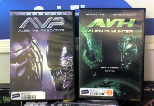
Several months ago I was browsing the local Blockbuster video store for a movie to rent, and I stumbled across one that made me laugh out loud. It’s the title on the right, and you’ll see why if you compare it to the rather more well-known title on the left.

I mean, seriously, look how carefully they tried to match the source material.
- The title, Alien vs. Hunter, as close as possible to the original Alien vs. Predator, carefully using only descriptive names.
- The logo design, with the TLA (three-letter acronym) in large type and the full title in small type below it.
- The layout on the packaging, with close-ups of the two creature’s heads, one on each side.
- The monochrome design, using green instead of blue.
- The creature designs, one with an elongated head and nasty-looking teeth, the other wearing a mask.
- Even the font on the full title is similar.
I have to admit I haven’t watched either of them, so I have no idea whether this attention to detail pervades the actual movie. But I can seriously imagine someone not paying close attention picking up the wrong movie by mistake.
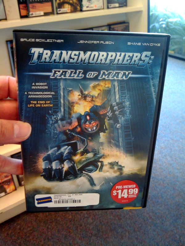
On the same trip, I found another video called Transmorphers — by the same production company, it turns out (big surprise) — but they didn’t try nearly as hard to match the packaging to anything Transformers-related. Still, for a good laugh, look through the titles of movies by The Asylum — I think Snakes on a Train may actually trump both titles.

