Clever UI design on ATM: with fast cash, it won’t give you the cash until after you take your card. Usually I grab it fast, so I never noticed.
Tag: usability
Pop-Up Design, Bird Buzz, and What is…the Thing?
- Running system restore on my Windows box at work. Just how I wanted to spend Monday morning.
- Dear HaloScan users: Please do not use the Javascript-only pop-up for your comments links. I can’t open that in a new tab.
- Grr. Dialog boxes should not pop up while typing. I hate accidentally saying OK or Cancel. Who runs only one app at a time these days?
- Just got buzzed by a bird on the way to the car.
- I don’t know why yesterday’s Real Life is so funny.
No, They Don’t Read
It’s clear that a lot of people don’t actually read web pages before they respond to them. They’ll do things like…
- Contact someone with a similar name, even when it’s clearly the wrong sort of organization — say, a student writing club and not the bookseller that’s been causing them problems.
- Ask a blogger for a job application for a company mentioned in the post.
- Ask unrelated tech support questions on a blog post because they used the wrong search terms for their problem.
- Ask for help creating Flash animations on a forum dedicated to the Flash super-hero, then get indignant when people have the gall to point out that they’re in the wrong place.
Now, usability guru Jakob Nielsen reports on a study showing just how much people don’t read. In the average visit, users only read 28% of your text if you’re lucky. You have to drop way down — to 111 words — just to count on visitors reading half of it.
Depressing, but it explains so much. And it suggests there’s a benefit to highlighting key phrases. If they’re only going to read ¼ of the text, you may as well make sure it includes the important stuff.
Apple UI Nitpicking
I appreciate that Apple offers a single software updater for all its free Windows software. But one thing annoys me about it.
It opens a window, then opens a message box showing a progress meter as it checks for updates. Only one problem: It fills out the “New software is available” caption before it actually checks.
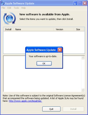
New software is available… oh, wait, no it isn’t.
This isn’t an issue on Mac OS X, because the progress meter is shown as a sheet, which drops down from the top of the main window and obscures the caption. But on Windows, that caption is visible from the moment the window appears, saying that you really do have something new available, raising your hopes that maybe, just maybe, Apple has finally gotten around to releasing that new version of Safari, or that security fix for the flaw you heard about a week ago, then dashing them to the ground.
Or, less dramatically, it’s jumping to conclusions, providing potentially false information.
And then, even if it turns out there isn’t anything new, the caption stays in place…leaving you with two contradictory statements as to whether any updates are really available.
Just can’t win
This is a story on phone menus, though it applies to anything where the user interface can change. I phoned in a refill on a prescription this morning. The phone system lets you choose when you plan on picking it up, presumably so that the pharmacy can prioritize people who are coming in sooner. Generally, it asks you to enter the hour, then #, then 1 for AM or 2 for PM.
I wanted to swing by around noon, so I entered 12, then #, and then without listening for the option, I hit 2. I wanted to pick it up around 12:00 pm.
So I was surprised to hear, “We’re sorry, the pharmacy is not open at midnight.” I flashed back to elementary school, when I was out on the field trying to explain to my friends why noon was 12 PM and not 12 AM as they insisted. Had someone managed to get into a programming position, without clearing that up?
As I re-entered the time, I listened for the options. It turns out that they had anticipated just such confusion, as after I chose 12, the option was, “Please enter 1 for noon, or 2 for midnight.” That works great for people who are using the system for the first time, whether they know noon is PM or not. Unfortunately, for people who have been using it for years and (normally) don’t need to listen to the options, it switches the buttons around. It’s like those WinZip registration dialog boxes that would rearrange the buttons every time, so that you couldn’t just click through, you’d have to pay at least some attention to it.
Of course, then there’s the question of why it even gives you the option for midnight…