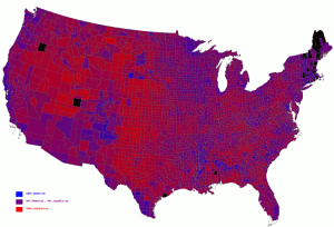
Veeery interesting! By now everyone’s seen maps colored in red/blue by state, which make the vote look very regional (the South and Midwest pull red, and the northeast, the West Coast, and the Great Lakes area pull blue). A map by county makes the country look extremely red, until you realize that many of the blue counties are the more populous ones, highlighting the fact that the split is primarily urban/rural.
A Princeton professor has taken the election results and produced a shaded map by county, with a full red-purple-blue continuum. Looking at this map, it’s clear we’re a lot more integrated than we think we are.
Hat tip: from a comment on peterdavid.net.
