OK, one more election-related post. This one comes from The Big Picture, and features links to various maps of election results. Comparisons of state vs. county maps, looks at which candidates were favored by people in other countries, comparisons to past elections and to pre-Civil War America… and of course the comedy (including the redistricted Jesusland and the United States of Canada).

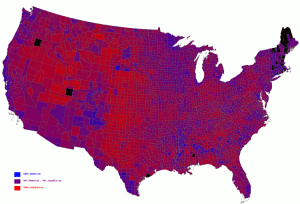
Interestingly, it’s missing the county-by-county Purple America, though it does have a link to the state-by-state one.

Found via WebWord.

Veeery interesting! By now everyone’s seen maps colored in red/blue by state, which make the vote look very regional (the South and Midwest pull red, and the northeast, the West Coast, and the Great Lakes area pull blue). A map by county makes the country look extremely red, until you realize that many of the blue counties are the more populous ones, highlighting the fact that the split is primarily urban/rural.

A Princeton professor has taken the election results and produced a shaded map by county, with a full red-purple-blue continuum. Looking at this map, it’s clear we’re a lot more integrated than we think we are.

Thumbnail of map

Hat tip: from a comment on peterdavid.net.

CNN: Lawmakers oppose election delay [archive.org].

Among the outcry is a resolution sponsored by Ohio Senator Bob Ney (a Republican, for the record) stating that “the actions of terrorists will never cause the date of any presidential election to be postponed” and “no single individual or agency should be given the authority to postpone the date of a presidential election.” There are about 60 supporters of the resolution, and another 190 representatives have slapped Homeland Security with a clue stick.

Thank you, Senator Ney.

Postponing elections is not something that should be done in a free society. The essence of democracy is that it is government with the explicit consent of the governed. Take away that consent — as in take away the ability to choose different leaders — and you no longer have democracy.