We took our annual trip down to Laguna Beach to watch the fireworks display launched off the bluffs. This time we made reservations for dinner at a restaurant we’d walked by a bunch of times, Ocean Avenue Restaurant and Brewery. Would definitely go there again.
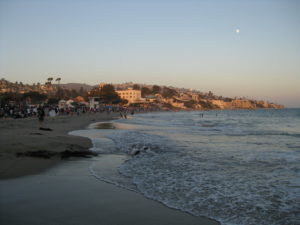
Around 7:30 we staked out a spot on the beach, which was already crowded. At the time we got there, the daytime beach-goers were just leaving, while the fireworks crowd was just arriving. I kicked off my shoes and waded out into the surf a bit, taking pictures of seagulls and scenery.  Then it became clear the tide was coming in, and we moved up the beach to an area that didn’t have any seaweed. Sure, it was 10 feet from a volleyball court and next to a group with a couple of umbrellas (which they never did take down), but at least we could rely on not getting flooded during the show.
It cooled off pretty quickly, and I went across the street to get us both some coffee at one of the two Starbucks. Yes, two. (One used to be a Diedrich.) The line was about 15 feet out the door when I got there, and it took me about 25 minutes to get through it, by which time I just ordered plain coffee so I could get out of there quickly. It had stretched to at least 40 feet out the door!
 The sky grew darker, the moon grew brighter, and stars started peeking out, and finally around 10 minutes to 9, a lone firework went off. I’m fairly certain they do a test fire, because there always seems to be one firework that goes off about 10 minutes before the show gets going. Soon we could hear low booming sounds in the distance, and flashes of light started appearing over the bluffs from the next display up the coast (Corona del Mar, maybe?)
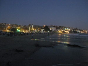
Meanwhile, the volleyball game was still going, even without any light except the moon and streetlights.
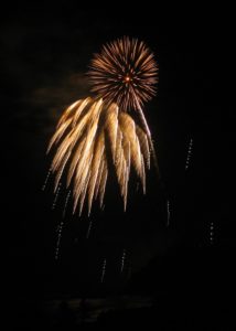
 A little after 9, the fireworks started, launched out over the ocean from somewhere behind the bluffs at the northwest end of the beach. The volleyball game stopped, people rearranged themselves to be able to see, and we ended up standing and drinking coffee. I experimented with the night and fireworks settings on my camera, and tried out the video on my phone, but mostly just watched. I actually got a few decent shots.
The wind was good, blowing the smoke parallel to the beach and keeping the view of the fireworks clear. (A few years ago, it lingered, so after a few minutes we got to see smoke lit up in pretty colors.) Every once in a while, I’d look behind to see the moon and the fireworks from the next display along the coast the other way (Dana Point?), barely visible in the distance.
After the big finale, just about everyone started leaving the beach, heading for one of the few places where you can cross PCH. We stopped at a gelato place on our way back to the car, tried some flavors, and shared a two-scoop cup with one scoop of ginger and one of pineapple chocolate chip. They went surprisingly well together.
By the time we made it back to the car (parked up near the Laguna Playhouse), the traffic had died down a bit and we had a smooth drive up the canyon. After a while, we started seeing bright flashes of light over the hills, and realized even after 10:00 there must still be another fireworks show going. As near as either of us could tell it was near the Verizon Wireless Amphitheater.
Finally got home, avoiding the two raccoons that ran in front of the car, washed the sand off of our shoes and feet, and I started going through the photos looking to see how many actually turned out well.
(Originally posted at LiveJournal. More photos at Flickr.)
