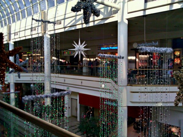
Lights strung across an empty walkway past empty windows.

During Wondercon I discovered that Anaheim Garden Walk is even emptier than I remembered it. This used to be the third-floor food court. There’s nothing there anymore.

The outdoor mall had the misfortune to open just before the recession hit, too close to Disneyland to attract locals and too far to attract tourists. It never completely filled in, and as old stores leave, new ones don’t seem to be taking their places. I’ve only been there a few times, mainly when I happen to be in the area for something else (like a convention) and it’s been odd and kind of sad to watch it slowly empty out.

It’s not completely abandoned like, say, the Hawthorne Mall. From the street, you’d never know there was a problem. The front is packed with chain restaurants like California Pizza Kitchen, P.F. Chang’s and Bubba Gump Shrimp, all of which seem to be doing well, or at least they were busy during Wondercon. Behind them, the main floor of the mall only has a handful of stores. There are a few clothing stores and a tourist welcome center. Almost every storefront is walled off.

Here’s a shot from 2010. Note that there’s only one open restaurant in the photo. It’s not there anymore.

Anaheim Garden Walk in 2010. The one restaurant open in this photo isn't there anymore.

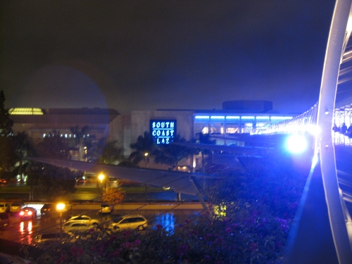
The top floor is just eerie, especially at night. When I grabbed lunch during Wizard World’s 2010 Anaheim Comic Con, they had several mid-range restaurants and a half-full food court. That’s all gone. There’s one bar and grill, which seemed to be doing well enough during the convention, but you really have to know it’s there. And then there’s a Johnny Rockets waaaaay at the back, which I imagine is only hanging on by being next to the movie theater. Otherwise, no one would go back there.

What makes it especially eerie is that the place is so well-maintained. It’s clean, well-lit, even decoratively lit. The walls are the same temporary walls put up when any other mall has an empty storefront or two, they’re just everywhere. It reminds me a little of the southernmost part of Irvine Spectrum when that section first opened, before many stores moved in…except that was part of a larger mall that was actually occupied.

It looks a LOT like the outdoor parts of the Del Amo mall…but if you stand up on the walkway outside the theater and look down, instead of a bustling courtyard with people milling around the fountain and walking in and out of stores, you’ll see an empty courtyard with flat walls.

Garden Walk Empty Courtyard

On the plus side, they did build a parking structure big enough for a full mall, which means that it’s available for event parking. Of course, even the parking structure is unfinished. I took this photo four years ago, and the top floor still looks like this — chain link, sandbags, exposed rebar and all.

Unfinished Parking

Very spiky balls hanging in the mall.

I’ve seen dangerous-looking Christmas decorations at the mall before, but at least those looked like…well, Christmas decorations. This spiked ball looks like something you’d find at the end of a mace, or maybe on the end of a chain for some knight to swing around.

Maybe the order called for a “morning star” and someone got confused?

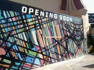
Remember that mall mystery from a while back? There was a storefront under construction at the Irvine Spectrum with an “Opening Soon” sign, but no indication of just what store might be moving in. They opened in December, and I keep forgetting to post a follow-up.

As you can see, all is revealed:
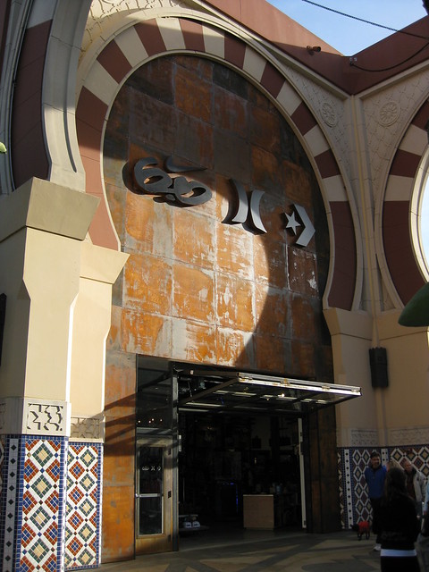
Storefront with three symbols above it, but no words.

…or maybe not.

Unless, of course, you recognize the logos for Hurley International (middle), Converse (right) and…what’s that on the left? With the Nike swoosh on top and the…skateboard? Sunglasses? Something on the bottom?

It’s kind of a throwback to the old medieval-style signs that showed an image instead of a name: the Prancing Pony, for instance (to pull an example from LOTR). Only instead of recognizable images, they’re symbols. Pictograms, if you will, only decipherable if you’re familiar with the symbols already, and they’ve actually thrown an obstacle in the way by muddling the most-recognized logo (Nike).

It seems odd to deliberately use a sign that would make a store hard to name (never mind figuring out what they sell), but I imagine that their target audience is quite familiar with the logos and wouldn’t have any trouble finding the store.