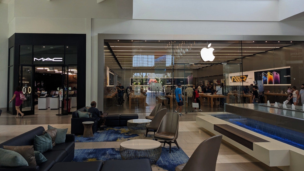
Took the Macbook in for battery service yesterday. Fortunately it was easy to tell which store to bring it to!
Took the Macbook in for battery service yesterday. Fortunately it was easy to tell which store to bring it to!
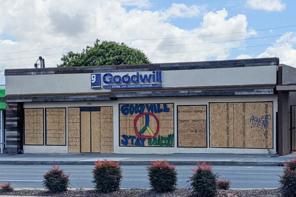
Scenes from pandemic shutdown: Shuttered Goodwill.
To be fair, I seem to remember they were already planning to remodel, so the plywood all over the windows could just be a case of bad timing.
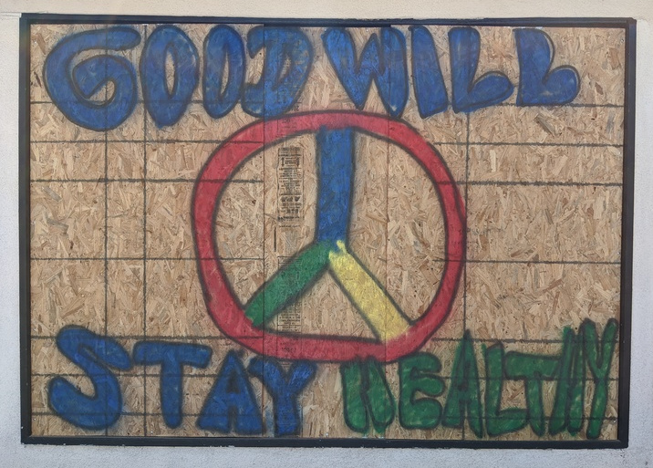
Update: Here’s a better picture of the sign from the near side of the street.
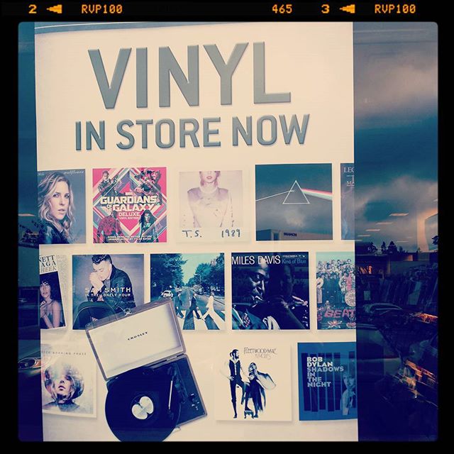
I stopped frequenting Barnes & Noble a while back because they were so determined to sell you a Nook and get you out of the store, never to return. (That, and for a while we had a great indie bookstore nearby.)
Now they’re selling vinyl records.
And holding events.
They’re doing Throwback Thursdays and a Fangirl Friday.
I don’t know if it’s a desperate attempt at relevance or a brilliant return to form.
I certainly know it’s not corporate-wide, though — or at least not evenly distributed — because a week later I went to another Barnes and Noble, one near a full-blown mall, and walked straight into the giant NOOK pavilion.
No sign of any events aside from a mention of filming during the Harper Lee book launch. Vinyl was being plugged in the music section in the back, but not right up front.
On the other hand, no one was staffing the NOOK pavilion, and half the tables were empty. So maybe it’s still being phased out?

 Remember that mall mystery from a while back? There was a storefront under construction at the Irvine Spectrum with an “Opening Soon” sign, but no indication of just what store might be moving in. They opened in December, and I keep forgetting to post a follow-up.
As you can see, all is revealed:
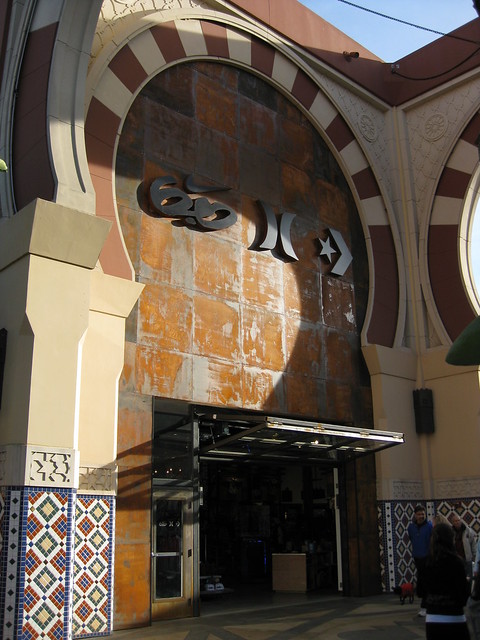
…or maybe not.
Unless, of course, you recognize the logos for Hurley International (middle), Converse (right) and…what’s that on the left? With the Nike swoosh on top and the…skateboard? Sunglasses? Something on the bottom?
It’s kind of a throwback to the old medieval-style signs that showed an image instead of a name: the Prancing Pony, for instance (to pull an example from LOTR). Only instead of recognizable images, they’re symbols. Pictograms, if you will, only decipherable if you’re familiar with the symbols already, and they’ve actually thrown an obstacle in the way by muddling the most-recognized logo (Nike).
It seems odd to deliberately use a sign that would make a store hard to name (never mind figuring out what they sell), but I imagine that their target audience is quite familiar with the logos and wouldn’t have any trouble finding the store.