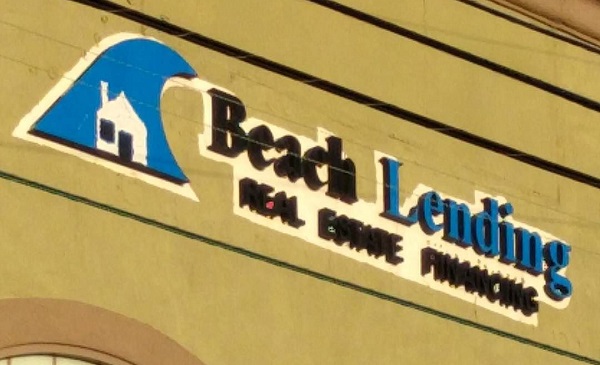
I always feel like this logo is warning you not to buy in the tsunami zone.
I always feel like this logo is warning you not to buy in the tsunami zone.
Whenever I visit a Dreamwidth journal and leave it open in a tab, I always find myself wondering why I was looking at the Debian GNU/Linux website. For possibly obvious reasons:
![]()
I can’t imagine how I keep mixing up a dark red 1½-turn counterclockwise spiral with a dark red 1½-turn clockwise spiral! 😀


The logo on the left was spotted on fire extinguishers at two different coffee shops (different chains, even). The one on the right is, of course, the logo from the 1984 comedy/horror film, Ghostbusters.
Maybe I’m imagining things, but does anyone see a similarity here?
A while back I was driving on the freeway and noticed a truck with this logo:
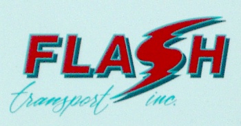
OK, so I’m maybe a bit focused on the Flash, but then I started looking at the design.
Hmm…
It got me thinking about commercial applications of super-speed. Not something that turns up often in the super-hero genre, but it shows up occasionally. Kapitalist Kouriers is the first one that comes to mind. They were a trio of Soviet defectors who decided to sell their services as couriers and, from time to time, heroes for hire.
Here’s another example of using a design that suggests a logo, rather than using it outright. This is a “Win Compatible” badge from the package of a KVM switch. (I think it was from IOGEAR.)

What I like about this is that it manages to get the idea across clearly even though it doesn’t use the actual Windows name or logo. “Win” is enough to get the name across, and the overlapping colored rectangles immediately call to mind the look of Windows 2000, Windows Me, and Office 2000. Sure, it’s one redesign back, but it’s still recognizable.
As for why they made their own logo? Well, it’s all hardware, with no drivers needed, so there really isn’t any point in putting it through the OS compatibility tests. You might as well label a monitor as being “Designed for Windows.” But not everyone knows what is and isn’t OS-dependent. Even those who do are more likely to buy it if they have that reassurance. I’ve looked at devices that I was 90% certain should work with any OS, but bought the one that specifically mentioned Mac or Linux compatibility because it filled in that last 10%.
Just saw a link for the current entries in the SpamAssassin Logo Contest. Entries range from a simple updating of the current logo through ninjas of varying danger and cuteness levels, and a few that have actually dropped the ninja motif altogether.
Oddly, a few of them remind me of the Peacekeeper insignia from Farscape. Maybe it’s just the red-and-black color scheme. Speaking of which, it turns out that logo was based directly on a 1919 painting called “Beat the Whites with the Red Wedge” by Russian Constructivist artist El Lissitzky. (originally linked to sebacea.com.)
Back to SpamAssassin, the contest is open through August 6.