The Golden Age (1940–1949)
Flash Comics (1940)
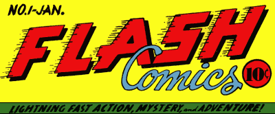
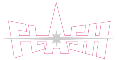
This was the initial logo for Flash Comics when it was launched in 1940. Note that it doesn’t actually refer to the Flash. It’s a title like Action Comics, or Sensation Comics, describing the flashy contents. This first logo stuck around for only 7 issues, and was redesigned within a year.
Flash Comics (1940–1949)
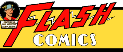
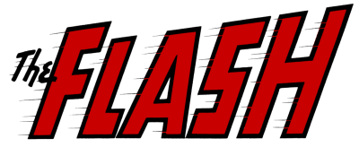
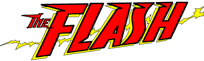
This design debuted on Flash Comics #8 and stuck around for the rest of the series’ 10-year run. Note the stylized lightning bolt in the background. As noted above, the Flash wasn’t the only star. He shared that honor with Hawkman. The two heroes alternated cover appearances, and the one who wasn’t on the cover that month got the cameo appearance in the corner. Like the previous logo, this one generally took up the entire top of the cover. Later issues (#85 onward) shrank it down, and the background band became a rectangle.
All-Flash (1941–1948)

All-Flash Quarterly, a book focusing (almost) entirely on the Flash, launched with a completely different logo. For some reason, this cursive look became the one most associated with the Golden-Age Flash, as this style of title was used on the splash pages for Flash solo stories through most of the decade.
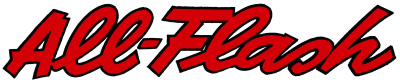
A slight modification was made with issue 6 (the letters are more upright, and note the shorter swashes on the A and F), and this version stuck through the rest of the series.
The Silver Age (1956–1985)
Showcase (1956–1958)
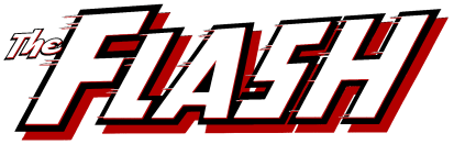
The Silver Age Flash made his debut in the pages of Showcase, where he appeared in four issues before DC decided to give him his own series. They briefly used a modified version of the Flash Comics logo with the F the same size as the rest of the title, and “The” in similar lettering. The speed lines from the earliest logo made their return here.
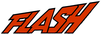
The Flash (1959–1985)
Once the Flash graduated to his own series, the logo went through another refinement, designed by Ira Schnapp.* The F was again emphasized, and the now-familiar flared letters made their first appearance. This design served for the entire run of this series, and was in use longer than any other Flash logo at 26 years!
This version is very similar to the logo introduced in 2000.
From Crisis to Crisis (1987–2006)
DC in the 1990s had a tendency to redesign logos over and over again. The Flash volume 2 went through five logos in its first 13 years before settling on one in 2000—at issue #160!
Flash (1987–1990)
Two key differences leap out about this first post-Crisis Flash logo, designed by Todd Klein: The letters lean even farther, and the word “The” has been removed. Some versions extended the baseline and top line across the cover and filled the space with speed lines.
Flash (1990–1992)
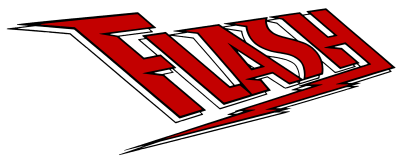
This is the most radical departure until the Dark Flash design ten years later. The letters are leaning to the left, serifs have been added, and a lightning bolt incorporated into the design. Most issues also added “The Fastest Man Alive!” above the title, in the space to the right of the top bar of the F. According to Todd Klein, this was a collaborative effort between Steve Bové, DC Art Director Richard Bruning, and Keith “Kez” Wilson.
Flash (1992–1995)
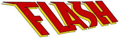
This simplified version of the previous logo appeared at the same time that Mark Waid took over as regular writer. The lightning bolt and the “Fastest Man Alive” have been removed, and the F is again the same size as the rest of the title.
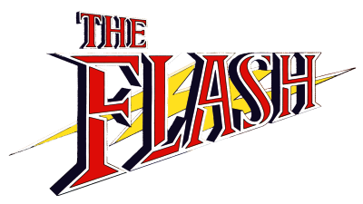
The Flash (1995–1999)
This design by Curtis King, which appeared beginning with issue #101, is similar to the previous one, with three main differences: It’s leaning to the right again. A lightning bolt has been incorporated into the background. And the title is once again The Flash and not just Flash. Compared with these, the differences in the cutouts are minor.
Impulse (1995–2002)
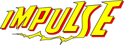
Impulse spun off from The Flash the month that Flash #101 came out, and the logos were clearly designed together. The shape of the letters, the serifs, the rightward lean, and the lightning bolt all show the connection. The letters are jumbled instead of lined up, appropriate for the title character’s disposition. The series kept this logo for its entire duration.
The Flash (1999–2000)
Issue #150 ended with the arrival of a new Flash, quickly dubbed the “Dark Flash” by fans because of his costume and attitude. When he became the lead in #152, the logo changed to this futuristic design. The “flying hot dogs,” as some called them, didn’t stick, and disappeared once the story arc was done.
The Dark Flash logo was designed by Rian Hughes, who also designed the Tangent logo.*
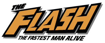
The Flash (2000–2006, 2009—)
With issue #160, The Flash entered a transition period. The regular writing team for the last few years was leaving, and no one had signed on to take their place. While DC worked on finding a new writer, they changed the logo once again, adapting the logo from the Flashpoint miniseries. John J. Hill’s design was very similar to the Silver Age logo. The letters are wider, though, and lean farther to the right. The word “The” is in a different face, and while the Silver-Age series rarely (if ever) used a drop-shadow, in this version it was standard.
DC kept this logo for six years, making it the longest-lived title design for the series. They returned to it in 2009 for Flash: Rebirth, Blackest Night: The Flash, and the 2010 relaunch.
One Year Later
The Flash: The Fastest Man Alive (2006–2007)
DC wanted to launch a new Flash out of Infinite Crisis, so the previous series was canceled and a relaunch planned. The new series was titled, in full, The Flash: The Fastest Man Alive, and its logo (again by John J. Hill) draws elements from several of the previous series’ designs. The shapes of the letters are drawn from the immediately previous logo, while the overall shape is flared like the 1987 design. The random serifs and cutaways are from the three designs that came in between (minus the flying hot dogs, for which we should probably be grateful).
The Flash (2007–2008)
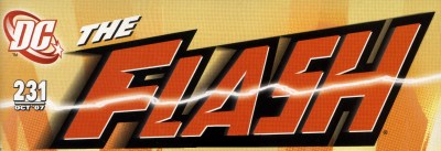
Flash: The Fastest Man Alive was canceled after only 13 issues, and The Flash was relaunched with a return to the old numbering, picking up with #231. Much in the way the 1992 logo simplified the previous version, staff designer Ken Lopez removed the subtitle “The Fastest Man Alive” and cut off the bottom of the F to give it a single baseline.
This version also added a motion blur and a realistic lightning bolt running across the cover in front of the title. These elements represent an improvement in technology. Back when titles were literally pasted on top of the artwork, the blending effects would have been difficult. Computer compositing makes it trivial.
A variation of this logo was used for the All-Flash special that appeared in the month between the end of the previous series and the relaunch.
Alternate Logos
Flash TV Series (1990)
In 1990, CBS broadcast a Flash TV series. The series logo took some aspects of the recently-redesigned logo, namely the sharp serifs and iconic lightning bolt, but otherwise went in another direction. There are at least three minor variations on this logo. The version used onscreen places the lightning bolt above the shadow. The version used on the DVD packaging leaves out the outline. The version shown above is from the Flash TV Special, a tie-in comic released during the series.
Speed Demon (Amalgam Comics)
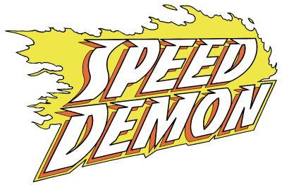
DC and Marvel Comics got together in 1996 for a crossover, Marvel vs. DC, and an event called Amalgam Comics. They combined characters from each company, and published twelve comics under the Amalgam Comics brand as if they were the first issues of ongoing series.
Speed Demon was a cross between the Flash, the Demon, and Ghost Rider. The logo by J.G. Roshell* was almost all Flash, though, based directly on the then-current Flash #101 logo, with Ghost-Rider–style flames instead of lightning.
Tangent Comics
Tangent Comics was a 1997 event in which DC created an entirely new set of characters, and an entirely new world, using just the names. It unfolded in a set of nine comics, each presented as the first issue of a series. The Tangent Flash was a teenaged girl who was made of living light. The logo uses this motif, looking like a burst of light.
DC followed up on the characters the following year in Tangent 98, another round of nine first issues. The Flash returned in Trials of the Flash, the additional words replacing the left side of the starburst.
The Tangent logos were designed by Rian Hughes, who also designed the Dark Flash logo.*
The Kingdom: Kid Flash
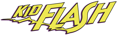
The Kingdom was a follow-up event to the Kingdom Come mini-series. The bookend story told of an attempt to change history, while the individual issues focused on the next generation of heroes. One of the books focused on Wally West’s daughter Iris, Kid Flash.
Just Imagine Stan Lee’s Flash
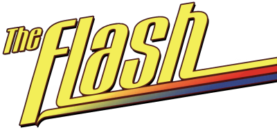
From 2001–2002, DC published twelve books in which Stan Lee, best known as one of the architects of the Marvel Universe, re-imagined DC’s heroes. The logo for this version of the Flash resembles her costume: sleek, with a multicolored trail.
The Emblem
![[Lightning in a circle]](images/logos-kda/emblem.png) The yellow lightning bolt in a white circle was introduced with the first appearance of Barry Allen in Showcase #4, back in 1956. While a simple lightning bolt had been Jay Garrick’s emblem, this logo has become “the” Flash symbol in the same way that the S-shield is tied into Superman’s design, or the bat-symbol to Batman’s. In addition to later Flashes Wally West and Bart Allen, numerous alternate reality and future Flashes have worn the lightning in a circle.
The yellow lightning bolt in a white circle was introduced with the first appearance of Barry Allen in Showcase #4, back in 1956. While a simple lightning bolt had been Jay Garrick’s emblem, this logo has become “the” Flash symbol in the same way that the S-shield is tied into Superman’s design, or the bat-symbol to Batman’s. In addition to later Flashes Wally West and Bart Allen, numerous alternate reality and future Flashes have worn the lightning in a circle.
 Notes
Notes
* Thanks to Crimson Lightning for identifying Rian Hughes as the Dark Flash/Tangent logo designer, as well as pointing to the Dial B for BLOG post indicating the likely Silver Age logo designer.
Letterer Todd Klein, who designed the logo for the 1987 relaunch, has posted a 4-part study of the Flash Logo, much more thorough and detailed than this one. Klein identifies more of the designers, and confirms that Ira Schapp designed the Silver Age logo. Except as listed above, all the designer credits come from this series. Part 1 · Part 2 · Part 3 · Part 4. Thanks to Wallyoeste for the links. Klein has also written up the Amalgam logos, in which he identifies the designer on Speed Demon.