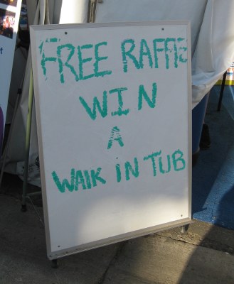
Sign in a parking structure. I suspect the font choice made it easier to miss the error.
Category: You Must be Mistaken
This Hurt to Read
I saw this sign in a coffee shop the other day. Honestly, the misspelling of Dr. Seuss’ name is more painful than the misspelling of nonsense, which you could at least look at as a stylistic choice.
I figured it was only kind to blot out the name of the shop at the lower left.
Wait, FOUR flavors? Shouldn’t that be a Chocolate Quadrilemma?
Chocolate Dilemma cheesecake?
Scarriest Place on Earth?
Wait…it got scarrier? Disneyland really needs a proofreader (a proffreader?) for their Halloween parking signs.
Either that or they added lots of people in Scar costumes, but the day didn’t bear out that theory.
Lick This Button
Spotted on this Wired article on how iOS7’s new visual style will open up app development by making it easier for new apps to be accepted on the platform.
Yeah, I can see that having to know “how to bounce fake light off of a lickable button” would be a barrier to entry.