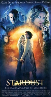
 Went out to see Stardust with a group of friends, and we all enjoyed it. People have been comparing it to The Princess Bride, and it’s an apt comparison: both are light-hearted fantasy adventures with a love story at the heart. Stardust takes itself a bit more seriously, though there’s plenty of humor.
The concept: Three groups of people pursue a fallen star (in this world, a woman). Tristran wants to bring the star back to impress a girl. The cruel princes of Stormhold are seeking the necklace she wears; the one who claims the gem claims the throne. The witch Lamia wants to cut out her heart to restore her own youth for another 400 years. Tristran gets there first, but has to bring her back without the more malicious seekers reaching her.
There’s swordplay, magic, betrayal, comedy, and romance. Michelle Pfeiffer throws herself gleefully into her role as the witch Lamia. Prince Septimus oozes slime as a cross between Prince Humperdink and Professor Snape. And Robert De Niro’s Captain Shakespeare is… indescribable. Charlie Cox as Tristran and Claire Danes as Yvaine (the star) manage to hold their own with the impressive cast of villains and supporting characters.
I was the only one of the four who had read the original novel by Neil Gaiman and Charles Vess, but for the most part I didn’t mind the changes. I did think the climactic battle got a bit overblown after a while, and I really missed one aspect of Una’s character which is revealed near the end of the book.
On a related note, it seems that in the last 3 weeks, the movie “adaptation” (and I use the term loosely) of The Dark Is Rising has been retitled as The Seeker: The Dark Is Rising, probably reflecting how far it seems to have strayed from the source material.
Stardust does it right: change the details, or even the structure if you have to, to make it work in a different medium. But stay true to the heart and spirit of the book.

 Went out to see