Maybe “Sent from my iPhone/Droid/whatever” is worth including…as a spelling disclaimer. (Sent from my G2)
Category: Tech
Adobe MAX 2010 in Tweets
I haven’t quite found the time to write up my experience at the Adobe MAX designer/developer conference, but here’s a digest of my Twitter posts. As usual, photos are on Flickr.
Sunday
- Watched a nearly-full moon set into the cloud layer behind the LA skyline on my way to Adobe MAX.
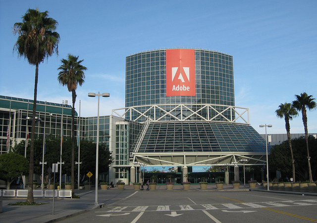
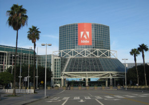
- Obligatory pic of Adobe MAX entryway.
Monday
- Made it to the keynote just as, I kid you not, Martha Stewart took the stage.
- Nice demo of dynamically wrapping text around image content (not box), to be contributed to Webkit.
- Content aware fill demo on a tablet – “performing witchcraft” on the progress bar label.
- Multi device link: iPad as classic color palette mixer for desktop Photoshop.
- Blackberry Playbook approach: don’t dumb down the Internet for mobile devices, bring up the performance of the devices.
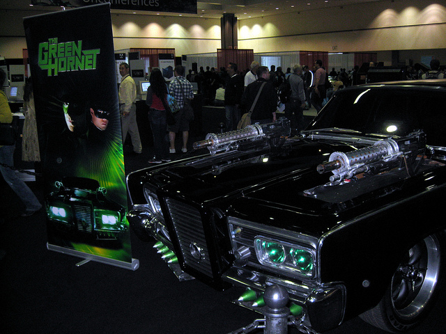
- Green Hornet game demo: same app running on desktop & touch screen phone, auto-detecting input methods.
- The Green Hornet car. I wasn’t expecting overlap between a tech conference and Comic-Con
- Something else Adobe MAX has in common with Comic-Con: Flash fans.

Tuesday
- When I got here, the line for Starbucks was about 5 people. Now I can’t see the end.
- Managed to scarf down a sandwich from Starbucks before the evening session. Interesting mix of tech crowd & Lakers fans.
- Ok, I am officially a geek. I ranked 7th in a phone-powered Star Trek trivia contest with several hundred people at a tech conference.
- And then tweeted about it.
- Adobe MAX sneak peeks’ method of keeping people from going too long: A Klingon with a phaser creeping across the stage.
- Very cool demo of auto-converting long video to a tapestry for better scene selection.
- Nifty Photoshop demo: post process photo based on a model. “what if this photo had been taken by Ansel Adams?”
- Nice! Automatically compensating for camera motion blur!
Wednesday
- Gotta love LA traffic. I left for Adobe MAX 40 minutes earlier than yesterday and arrived at the same time – too late for my 8:30 lab.
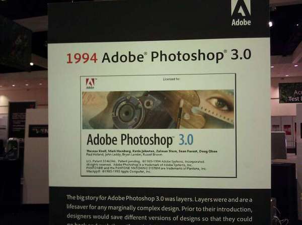
- Funny how you can get nostalgic for your first version of Photoshop. (Sadly, 2.5 is missing.
- MAX is definitely less crowded today. No problems finding a table for lunch, and the cell & wifi networks are a lot less congested.
GPS Navigation Convert (Sort of)
I’ve never been a fan of actually using GPS navigation. Sure, I’ve always thought it was insanely cool that it was possible, I just didn’t want to use it myself. For unfamiliar destinations I generally prefer researching a route first, and for familiar ones I generally prefer just relying on my local knowledge. But I’ve found something that I do like using it for: Traffic.
I recently started a new job, exchanging a fairly short commute for a ~40-mile trek across the Los Angeles freeway system. Under ideal conditions, it’s about 45 minutes. When the freeways are bogged down (i.e. when I’m actually going to be driving), it can take an hour and a half or more.
When I landed the job, I replaced my phone with a G2. It’s a heck of a lot faster than my old phone, plus it can handle newer software…like Google’s turn-by-turn navigation app for Android. After trying a couple of different routes the first few days, I tried it out…and discovered that it factors in live traffic data when calculating the remaining time.
The upshot: I can walk out the door, start up the app, and figure out which of three main routes will get me there fastest. (Well, least slowly, anyway.)
Of course, it’s not perfect. It’s based on traffic now, and over the course of a predicted hour-plus, the route could easily get more congested. That’s not even counting potential accidents. It does seem to update frequently, though, and knowing I’ve avoided a 100-minute drive in favor of 70 minutes really outweighs the annoyance of a mechanical voice telling me how to get to the freeway from home.
 I do have to remember not to rely on it too heavily at the end of the trip, though. I left it on by mistake after selecting my route to the LA Convention Center for Adobe MAX this morning, and instead of turning it off, I let it direct me straight past the parking garage.
Oops.
New Plugin: Nice Links for Twitter Tools
Lately I’ve been linkblogging via Twitter, and using Alex King’s Twitter Tools to build a weekly digest in WordPress. The problem is that since I’m pulling the posts from Twitter, I’m stuck with Twitter’s limitations: Short descriptions, cryptic URLs, and unreadable links.
So I wrote a plugin to process the links. When Twitter Tools builds a digest, the plugin calls out to the remote site, follows redirects, retrieves the final URL and (if possible) extracts the page title. Then it replaces the cryptic-looking link with a human-readable link, transforming this:
Check out this site: http://bit.ly/9MhKVv
into this:
Check out this site: Flash: Those Who Ride the Lightning
If it can’t retrieve a title, it uses the final hostname. If it can’t connect at all, it leaves the link unchanged.
The download is here, and that’s where I’ll put future versions:
» Plugin: Twitter Tools – Nice Links.
Future
One thing I’d like to add at some point is cleaning up the title a bit. They can get really long, even without people trying to stuff keywords and descriptions in for SEO purposes. All it takes is a page title plus a site title, like this one. That’s a much more complicated problem, though, since there isn’t any sort of standard for which part of a title is the most important. I suppose I could just clip it to the first few words.
I’d also like to clean up duplicate text. Often the link title and tweet content are going to be the same, or at least overlap, especially if it’s generated by a sharing button or extension. That should be easier to check.
If This Were a Real Emergency, You’d Be Dead By Now
I suppose I can understand putting one of those “If this is an emergency, please hang up and call 911” messages on a health insurance phone menu. But if you’re going to have one, shouldn’t you put it before the five-minute member identification/sign-in process, not after?
Admittedly, the process only took that long because their voice recognition system wasn’t getting along with my voice, but still, isn’t the point to route people to the fastest response in an emergency?
New Server
After years of piggybacking on employers’ web servers (with permission, of course!), I’ve moved my personal websites to a third-party web host. It’s kind of weird to be dealing with a web server that I don’t fully control, but DreamHost is really flexible and (most importantly) specifically supports WordPress.
The only thing I’ve really missed so far is Apache’s mod_speling [sic], which will automatically correct any one typo or capitalization error when trying to reach a file. It’s nice to have, but far from critical.
Links: Clouds, the Blue ‘e’, and Bobby Tables

- Incredible photo from APOD: Clouds, Birds, Moon, Venus. I’ve finally replaced my Woodbridge Snow photo as my desktop wallpaper at home.
- Microsoft provides an interesting look back at the evolution of the Internet Explorer logo over the past fifteen (yes, fifteen) years.
- 100-year data preservation. A 350-year-old copy of Shakespeare is still readable. But what about that 35-year-old floppy disk?
- Funny: Swedish voters submit SQL injection and JavaScript attacks on hand-written ballot. The article’s title refers back to the XKCD comic about “Bobby Tables.” (via Slashdot)