- Discovery spacewalk seen from the ground (Thierry Legault, of course!)
- Majestic Snow Batman towers over Vermont
- Ultra hi-res moon. The full-sized image is 24,000 x 24,000 pixels and half a gigabyte!
- Flash Coffee is a product tie-in just waiting to happen! (That F’ing Monkey). It would fit right in with the Central City Track Team shirt.
Category: Web Design
Webkit display:table-cell Problem
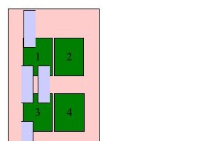
 I recently tried to retrofit a mobile layout onto an old table-based site using CSS. It was a fairly simple layout: A banner across the top, two columns, and a footer. I figured I’d use CSS to “unwrap” the table and make the sidebar and main content area into full-width sections instead of side-by-side columns.
 In theory this should be simple: CSS handles tables by using the
 display property and assigning it table, table-row and table-cell for the <table>, <tr> and <td> elements. You can assign these properties to other elements and make them act as tables, or you can assign block or inline to these elements and make the table act like a series of paragraphs.
") Initial testing worked perfectly in Firefox 3.6 and Opera 10.5x. Internet Explorer 8, as expected, ignored the changes entirely. Chrome, however, did something very strange, and Safari reacted the same way: The banner shrank, and the columns changed from a narrow sidebar to a 50/50 split…making it actually worse for small screens.
Initial testing worked perfectly in Firefox 3.6 and Opera 10.5x. Internet Explorer 8, as expected, ignored the changes entirely. Chrome, however, did something very strange, and Safari reacted the same way: The banner shrank, and the columns changed from a narrow sidebar to a 50/50 split…making it actually worse for small screens.
Clearly WebKit didn’t like something I was doing. Unfortunately, WebKit powers the exact platforms I was targeting: the iPhone and Android!
I dug around with the developer tools a bit to see if I could figure out what was going on. Was the browser not applying the property? Were the table cells inheriting the “original” property from somewhere else? Did I need to change properties on thead and tbody as well?
 What I found was that WebKit did recognize the
 display:block I had added, but somehow the computed style was reverting to display:table-cell. This only applied to table and td, though. Table rows actually did what I told them to, which was why the result ended up looking bizarre.
If it hadn’t changed anything, I probably would have chalked it up to the capability just not being implemented yet. But since it worked on table rows, but not on cells, I decided to treat it as a bug in WebKit and went looking for the best way to report it. I ended up creating a WebKit Bugzilla account and reporting it as bug 38527.
Check out the testcase in Firefox 3.6 or Opera 10.5 to see what it should look like, then take a look in Chrome 4 or 5 or Safari 4.
Comic-Con Hotels 2010: Reviewing the Reservation Form
 It was fast. Anticlimactic, really. It took a few reloads to get the Comic-Con International home page up, but once I could click on the reservation link, everything went smoothly. I was done by 9:05.
The reservation page was actually optimized!
- Just one image: a banner across the top.
- Everything was on one page, including the list of hotels, the personal info, and the hotel choices.
- Hotel selection was done by client-side scripting, so there was no wait for processing between selections (and no risk of typos confusing their processing system later today).
This is a huge deal, especially compared to Travel Planners’ horribly overdesigned 2008 forms — yes, forms, plural — that kept bogging down. (I never even saw last year’s, though I tried for an hour and a half to get in.)
On the downside, that one page does load a half-dozen script files, but that doesn’t seem to have slowed it down much.
In case none of your 12 choices were available, they asked for a maximum price you’d be willing to pay for another hotel that’s not on your list. I vaguely recall this being a feature of the old fax forms, but I don’t remember being asked this on the phone last year.
I was surprised to find that they didn’t want credit card info immediately, but that’s good from a streamlining perspective as well. The hotel choices, room type, and contact info are critical in order to make the reservation in the first place. Payment can be done later, so in a rushed situation like this, it’s better to handle it later. Plus, not asking for credit card information means that they could run the site without encryption, speeding things up a bit more.
I would have liked to have gotten a confirmation number for the request, or an email, just so that I could be sure that I was in their queue. And to be sure that I entered the right email address. And the right start and end dates. And…well, you get the idea. I’m a little paranoid about the process at the moment.
Here’s hoping that the back end of the process, and sending out confirmations, goes as smoothly as the front end did.
Update: Short answer: it didn’t. Long answer: I’ve written up what went wrong, at least from the guests’ point of view.
E-Flashback
Yesterday I received an e-mail newsletter from WebRing. The major story: guestbooks and counters are now available.
Yes, guestbooks and counters. For WebRing.
The 1990s really are back!
Card Usability
Usability question: Is it better for a form to auto-detect the credit card type from its number, or have the user select it as an error check?
(Consensus on Twitter and Facebook was to have the user select it.)
Best Way to Label Dead Links
I use the Broken Link Checker plugin on this blog and on Speed Force to find broken or moved links. In addition to helping you manage them in the admin interface, it can also assign formatting (as a CSS class) to mark them in your posts.
Cool! Readers can see that the link is broken before clicking on it!
But what’s the best way to label the links?
The plugin uses strike-through by default. You are marking something that’s gone, but strike-through usually means the text is being crossed out. That’s fine for a link in a list, but something like “Catering was provided by MyNiftyFoodCo” implies that the name of the company is wrong, not that the website is gone.
Just making something italic or changing the color doesn’t work either, because it’s arbitrary. Nothing about an italic link (which could be a title), or a random other color, suggests that something might be missing.
What I’ve come up with is to reduce the contrast on broken links. It combines two familiar schemes:
- High contrast for new links and low contrast for visited links.
- “Graying out” inactive items in software.
So here, I’ve got bright blue for new links, darker blue for visited links, and broken links as black (well, very dark gray), the same color as surrounding text. I’m keeping the underline in place so there’s still some indication that it’s a link, but it’s not as strong as the label for one that’s still functional.
It’s still not ideal, since color is the only difference, but it should cause less confusion than the strike-through.
Color-Switchin’ Coraline Apocalypse
Neil Gaiman remarked on his blog that images his agent emails from Germany end up with the colors inverted, and posts an example of a Coraline poster:
")
“…ah yes, I thought. That’s the sequel, all right. CORALINE APOCALYPSE”
I used to run into this with TIFF images when building websites. (No big surprise, given that there are a million variations on the TIFF format.) I think it was around 2000 or so that I was working on a website for a law firm, and they sent me their logo. The logo, as I received it, was yellow on light blue, so I built a site with black text on a white background for the main areas, and yellow on light blue (matching their logo) for the title, navigation, and borders.
I sent them a link to the test site. They looked at it, and said it was very nice, but could I try to match the color scheme on their logo instead?
It turned out that red and blue had gotten switched around (and possibly more, because I can’t remember how the yellow ended up in there), but anyway it was supposed to be white on light brown. I switched the channels, redid all the graphics and styles for the site, and they stuck with it for several years.
Back on the subject of Coraline, Gaiman adds in his post that the film has become “the second highest grossing stop-motion film ever” after Chicken Run. So why does it seem to be forgotten already? Just two months ago, commentators were falling all over themselves to say Coraline was the turning point for 3-D animation being part of the storytelling and not just a gimmick. Now everyone’s talking about how Monsters vs. Aliens is the turning point for 3-D animation being part of the storytelling and not just a gimmick.