I’ve been meaning to write a post about email newsletters that still assume you’re reading on a desktop and send out layouts that rely on a wide screen size and end up with tiny 2-point type on a mobile phone — you know, where most people read their email these days.

Then I stumbled on this usability article by Jakob Nielsen.

From 2012.

It pretty much covers what I would have said, and more. But a decade on, I still get email I can’t read without moving to a bigger screen.

The Time Before Tables

The funny thing is that HTML, by design, already adjusts to different sized displays, windows and terminals. In the very early days, you couldn’t make it not be responsive unless you added a block of pre-formatted text.

Once HTML picked up a little more rendering capability (tables, images and image maps), you had people designing websites who were accustomed to fixed-size media, and the paradigm stuck.

— Build your layout in Photoshop at 800×600, then slice it up into clickable pieces and reassemble the whole thing on a page!
— Wait, now we can aim for 1024×168!
— Oh, hey, we have widescreen now!
— Huh? What do you mean the window isn’t always fullscreen?
— Phones now? Ugh, I’ve gotta make a totally different website!

And so on.

Responsive Styling

These days you can apply relative sizes to everything, and tweak the layout based on the logical screen size instead of physical pixels. (Shout-out to high-definition displays here!) Modern HTML+CSS is amazingly improved in flexibility, and if you plan it right, you can often just rearrange the same page for screens from small cell phone size up to those widescreen monitors. Obviously this depends on what kind of site or application you’re building.

But for email, especially for newsletters, where reading the text is the main point, it should be an obvious choice!

Expanded from this thread on Wandering.shop.
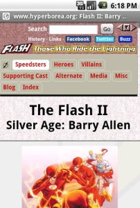
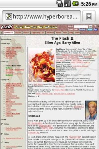
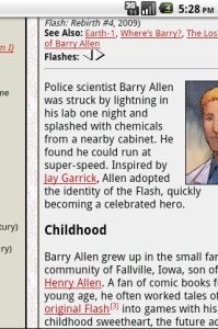
A few years ago, I tried to give some of my most-used websites a nice, clean look on mobile browsers by adding a stylesheeet with the “handheld” type. Then the iPhone came out and ignored them, and everyone copied that behavior, making it useless.

Somewhere along the line, I revisited the same CSS techniques, but used the “max-width” media query to change the layout on smaller screens. This seemed even better in the long run, since screen size matters more than whether a device is a desktop computer or a handheld computer. (The iPad was nothing but a long-standing rumor in those days, but demonstrates this clearly.)

The raw screenshots (click to view) are slightly larger, but since mobile devices often have denser screens, if you’re reading this on a desktop, it’s probably about the same physical size.

That worked great on the iPhone, and on the G1, which I updated through Android 1.6. I stopped testing it after a while, and no one commented on it, so I figured it was still working. (Reminder to self: that’s always a mistake.)

Last week I got a G2, which came with Android 2.2. Last night I visited one of my websites, and was presented with this shrunken, unreadable mess…because Android doesn’t actually use the real screen size anymore. It pretends it has a bigger screen so that it can present a desktop-like view and then let the user zoom around. Mobile Firefox does the same thing.

<rant>Why is it that every time I find a clean technique to use the same markup on both desktop and mobile devices, some browser manufacturer decides to bypass it in favor of giving the user a clunky imitation desktop view instead of one optimized for their experience?</rant>

*ahem*

Anyway, it turns out it’s possible to fix this problem with the <meta viewport tag> as shown here:

<meta name="viewport" content="width=device-width">

So I can provide nice, clean small-screen layouts again…after I add extra markup to every single page that uses these stylesheets.

Problem solved!

Well, almost. It fixes the layout…but it also prevents the user from zooming out for quick scrolling, which can be awfully useful on a long page.

Screenshots of the Barry Allen Flash profile, taken using the Android SDK emulator with stock Donut and Froyo images.

I’ve been hoping to try out Google Buzz, but it hasn’t hit my Gmail account yet and it won’t run on my phone*…even though it’s a web app. Comments at Android and Me and at Mashable show that I’m not alone.

It turns out that Buzz uses HTML5 features (specifically appcache, database and location) to store local data and to detect your physical location…and those capabilities were added in Android 2.0.

The support thread mentions that they are “working on another version that will make Buzz for mobile accessible on older Android OS versions (and some other smartphones as well).” The browser in Android 1.6 and below supports similar capabilities through Gears, so they may be planning a Gears-based workaround.

This would be a lot less of an issue if it weren’t for the fact that most of the Android phones out there still run 1.6 or even Android 1.5. IIRC only the Droid and Nexus One have officially been updated to 2.0 so far**, so unless you have one of those two models, you’re more likely to get Buzz to run on an iPhone than Android.

Funny, that.

*I’ve got a G1. It can only access Buzz through the updated Maps app, which brought up a bunch of people in nearby office parks posting things like “Testing Buzz” and “WTF is Google Buzz?”

**A few other phones have had updates announced, but I don’t think any have actually shipped yet. I could be wrong.

When the first Firefox 2 beta was released, I looked into Microsummaries, a feature that enables bookmarks to automatically update their titles with information. I concluded they were useful, but not for anything I was doing. The main application would be my Flash site, but it already had an RSS feed for updates, and a microsummary could only really include the most recent item.

Now the first IE8 beta supports Webslices. They’re similar in concept, but can include formatted data (not just plain text) and use microformat-like markup on the web page instead of a <link> element in the head.

I figured with two browsers supporting the concept, I’d give it a shot. I adapted the script I use to generate the RSS feed so that it will also take everything on the most recent day and generate a text file, which is used for the Microsummary title. For the Webslice, to start with I just marked up the “Latest Updates” section of the home page. Since I haven’t installed IE8b1 at home, I’m using Daniel Glazman’s experimental Webchunks extension for Firefox to try it out. Unfortunately the extension doesn’t seem to resolve relative links in its current state.

The real question, of course, is whether either technology offers anything better than what feeds can do now.

I think I’ll end up going the external-feed route for the Webslice as well, since it’ll use a lot less bandwidth than having a bunch of IE installations pulling the entire home page once a day. Plus since I’m using SSI on that page, it doesn’t take advantage of conditional requests and caching, and a static file will. But that’ll have to wait. Lost is on in 2 minutes, and after getting up earlier than usual this morning, I’ll probably be going to bed right after the show.

Update: I checked in IE8, and the webslice does work as expected. A few minor differences: Webchunks pulls in external styles, like the background and colors, while IE8b1 only uses styles in the chunk itself. Interesting bit: I’m marking up list items as entries, and IE8 is actually displaying them as a bulleted list, while Webchunks is simply showing the content.

So it at least works. Maybe tonight or Sunday I’ll see if I can refine it a bit.